PKV
Branding
full of energy
- Strategy
- Branding
- Printed Materials
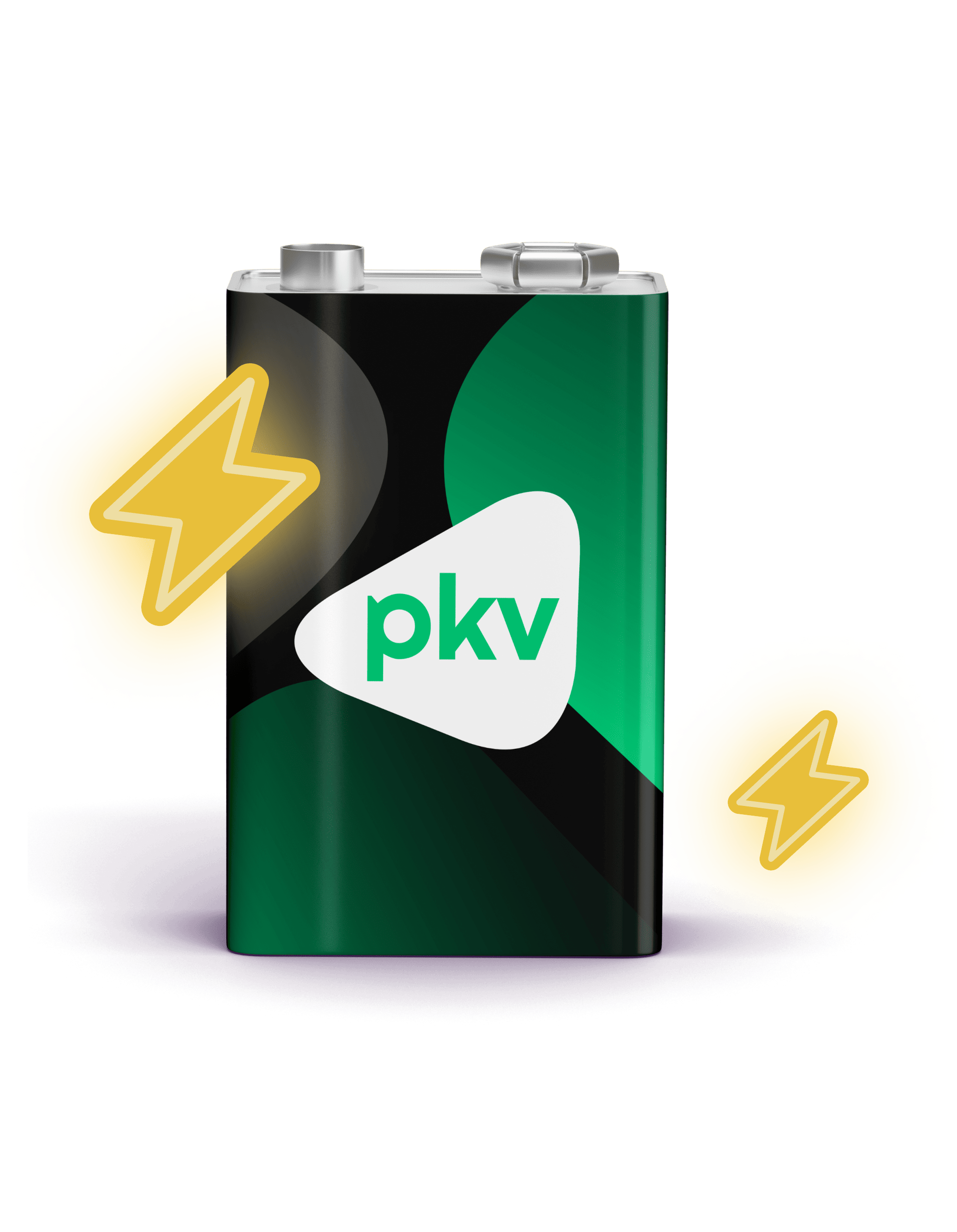
PKV is the only energy strategy partner your business needs. It’s also a fast-growing brand we met when its existing identity wasn’t enough. We built on the strategy by House of Rezac, refreshed the visuals, and expanded the number of graphic elements.

In the beginning, there was a logo…
The customer gave us carte blanche with the visuals. We chopped off the existing brand elements until only the logo was left. We saw no reason to change it. On the contrary – we built everything around it.
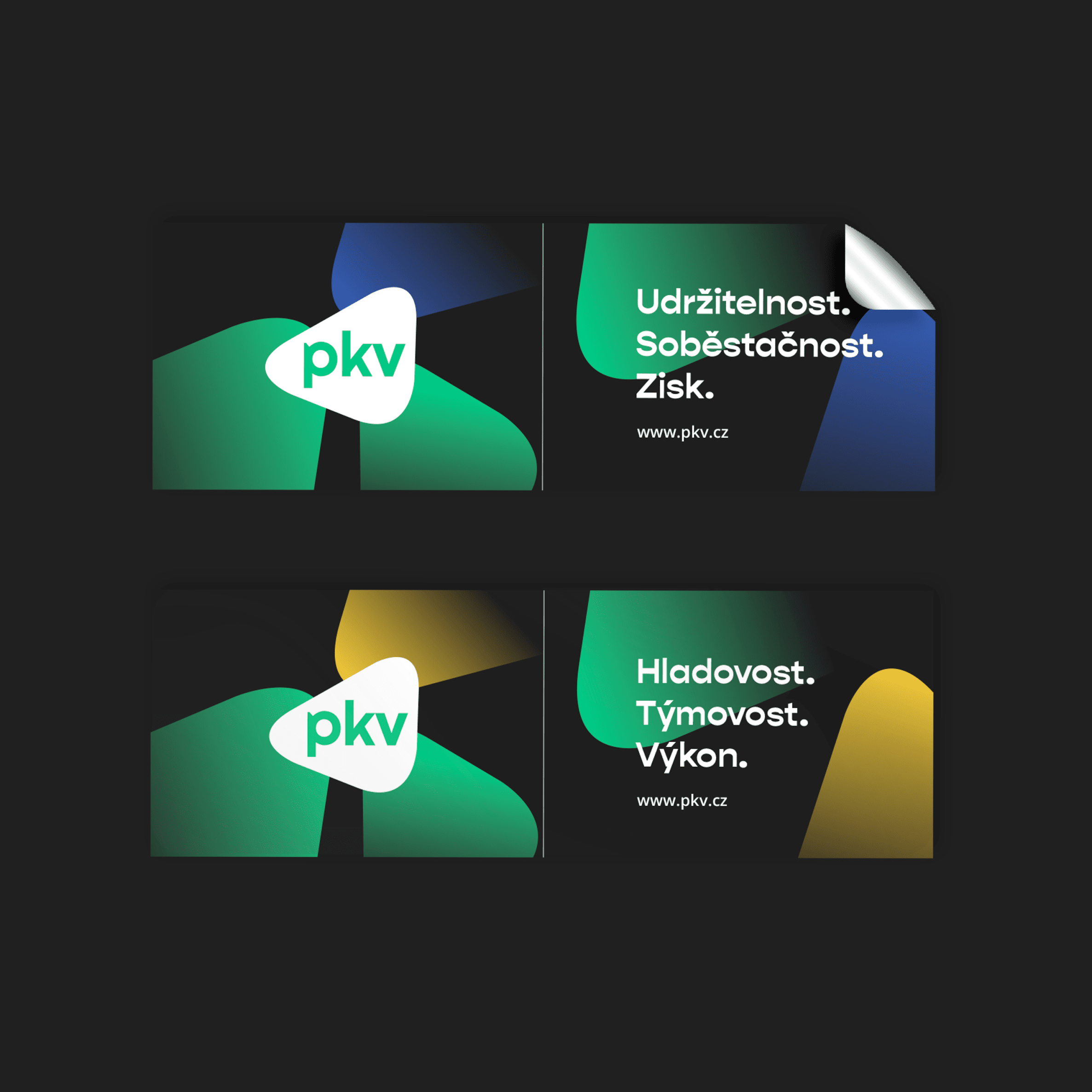
It is also the basis for the simple symbol intersecting lightboxes, catalogs, or internal materials.

Young Typeface
You won’t find anyone over 40 in the customer offices. They’re hungry, efficient, and predatory.
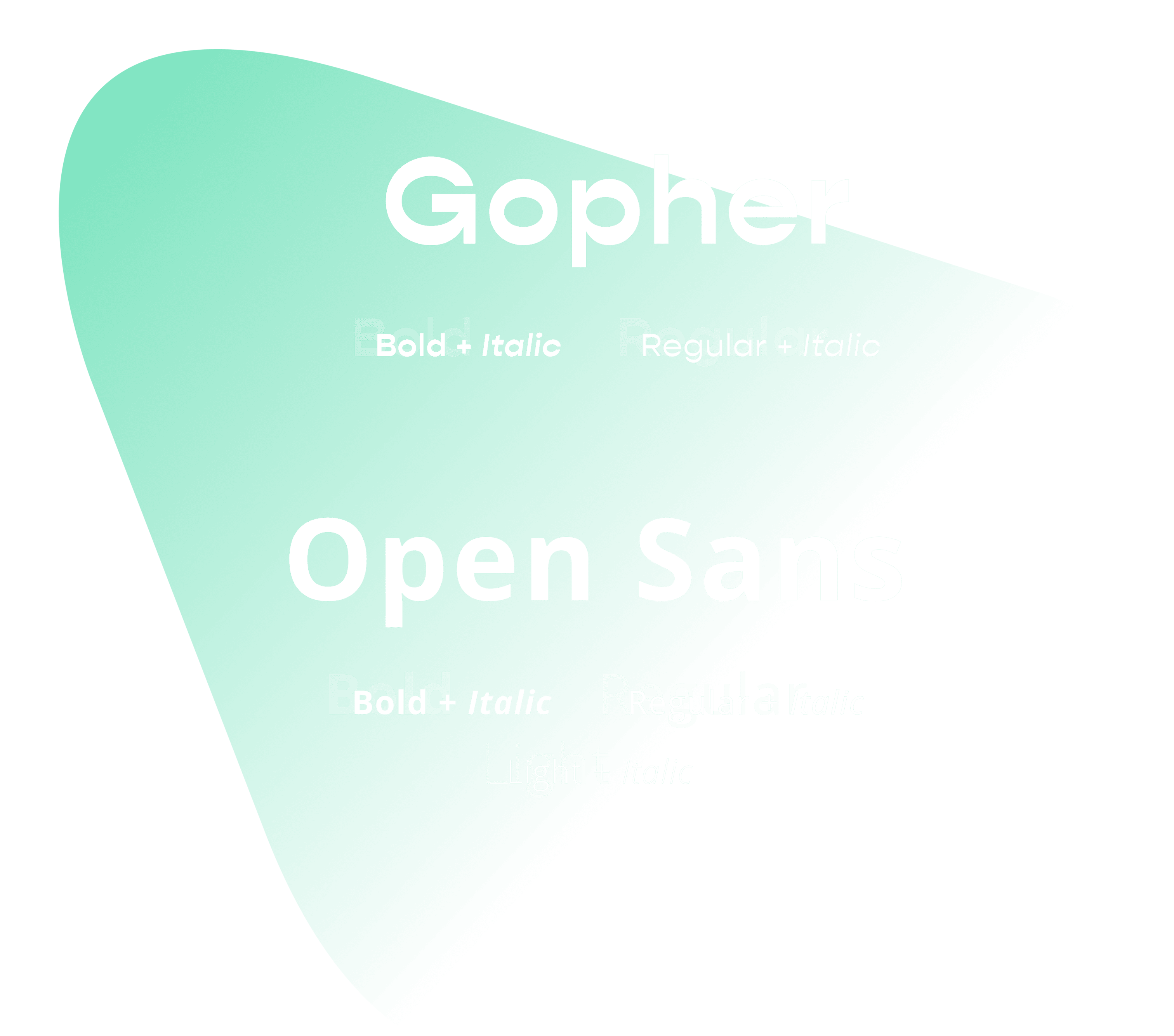
Such attributes deserve a bold font. Gopher
is atypical in the robustness of its horizontal lines, which are thicker than the sides of the letters.
We were balancing among colors…
Due to the company’s growth, the customer needed broader communication possibilities.
Thus, we decided to expand the color palette. However, diversity in design can be a tricky thing.
In defining new colors, we had to be very careful to ensure that under all circumstances, it remained true to PKV. That went well. All the colors work both individually and collectively.
But the main goal was to differentiate between internal and external communication. The customer uses red and yellow for internal purposes or in an HR context. For outward-facing communication, they mainly use more cautious shades of blue and purple.
And how did we find the right colors? Brand’s essential values helped us. To each of them, we assigned a color that symbolizes it.


We’ve never done a more extensive brand manual.
Because PKV was determined to reflect the identity everywhere, they wanted an honest basis for further work from us.
The brand manual, therefore, includes instructions for creating icons, for variable work with an element based on the logo, or for an overview of call-to-action buttons. We did not forget about working with photos or layouts of various materials.


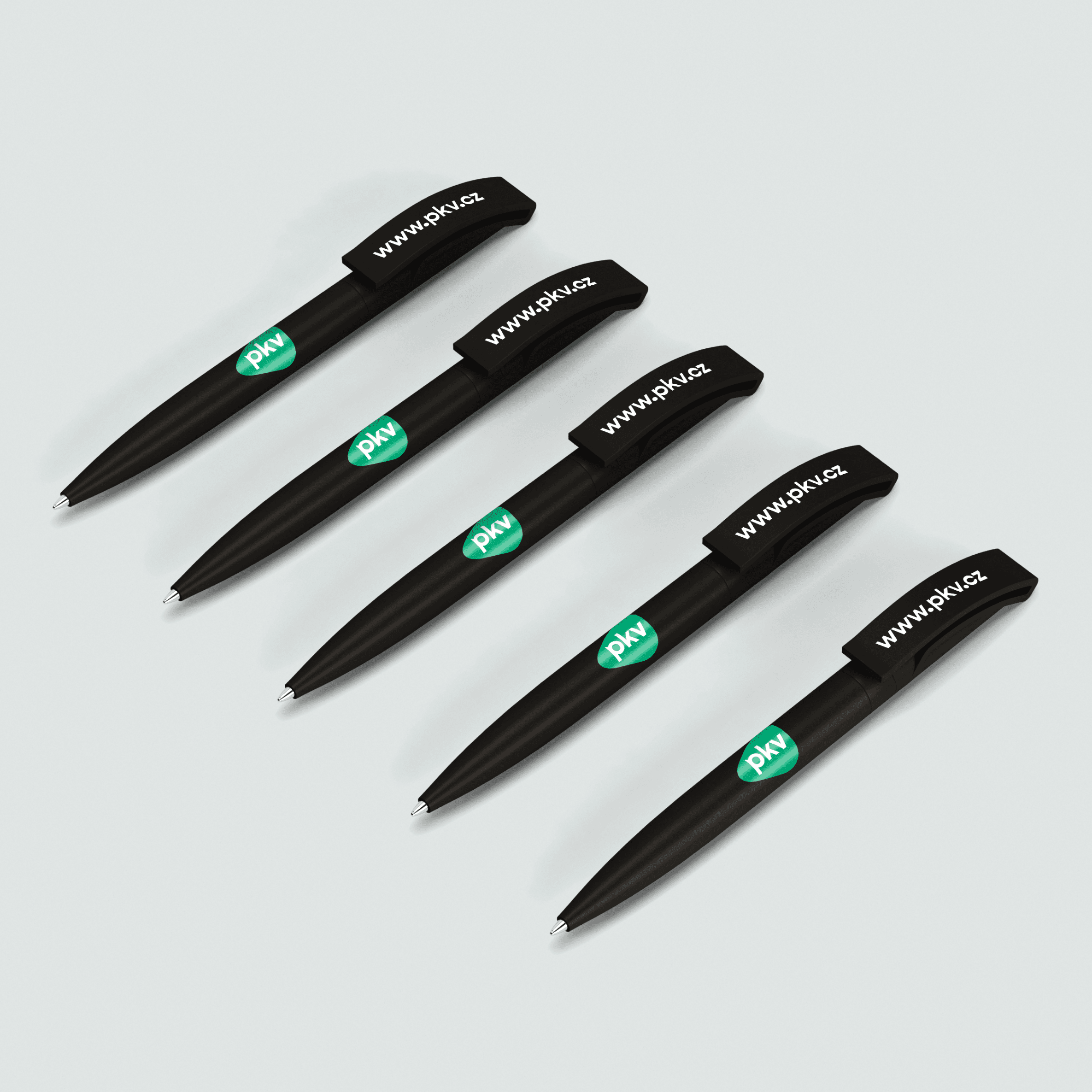

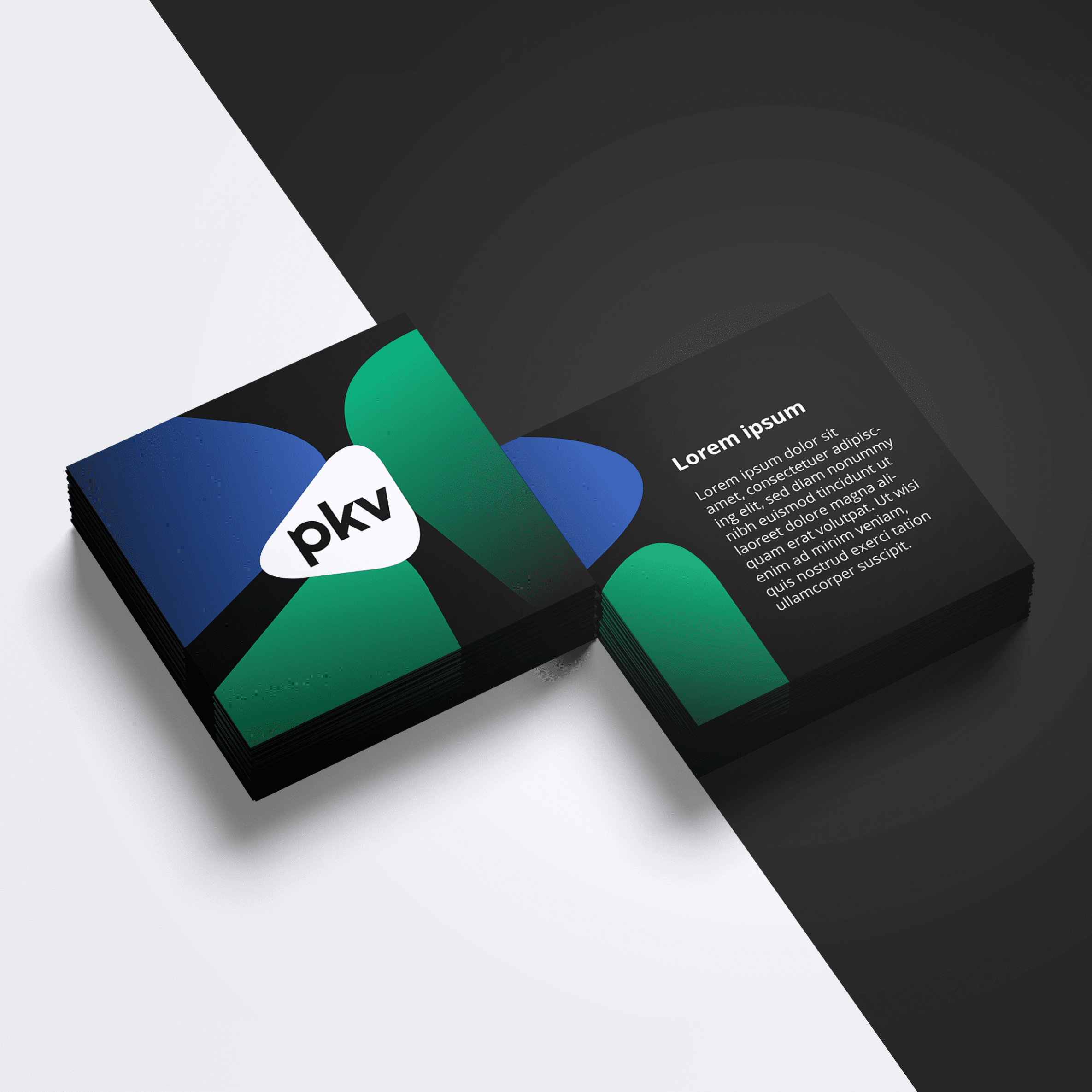


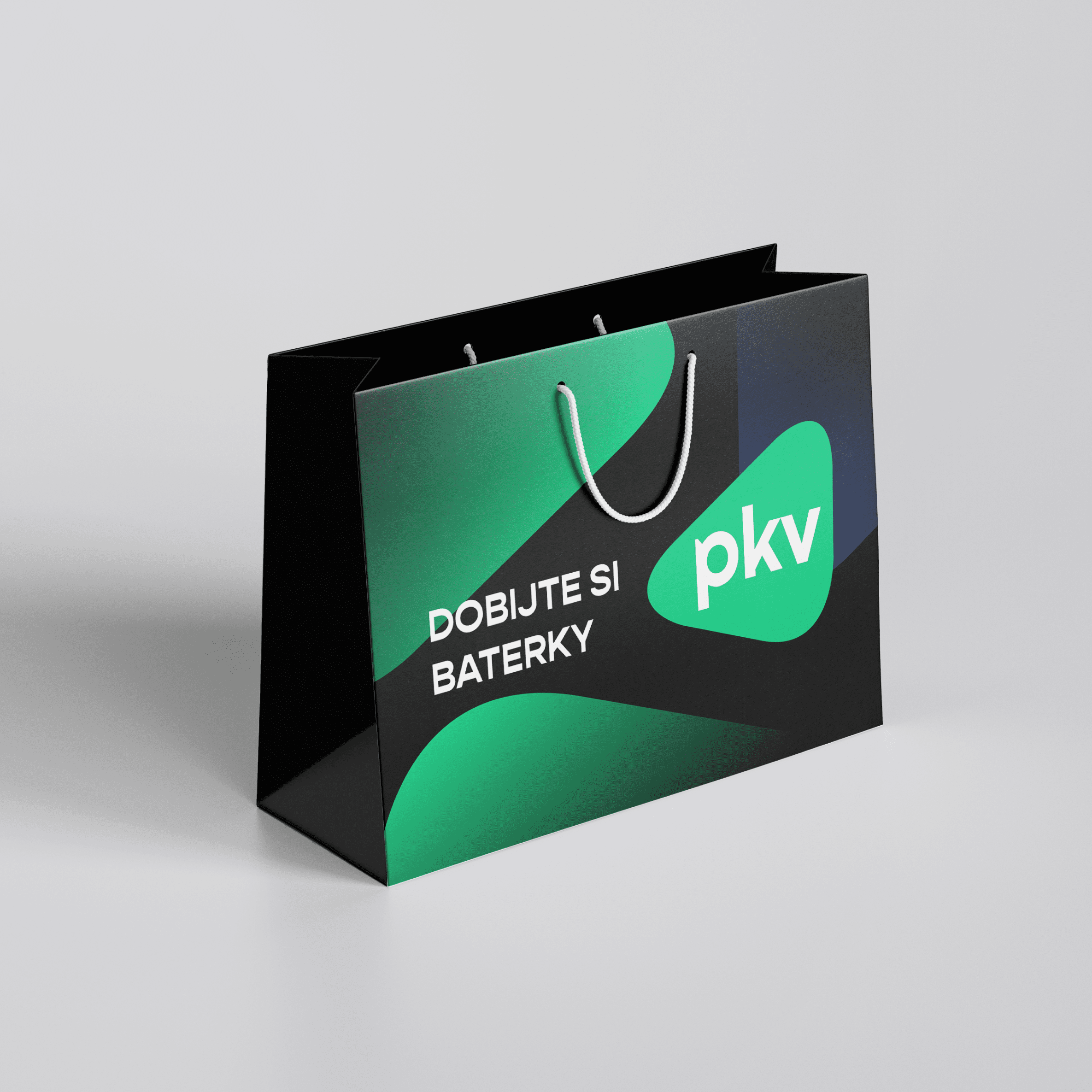

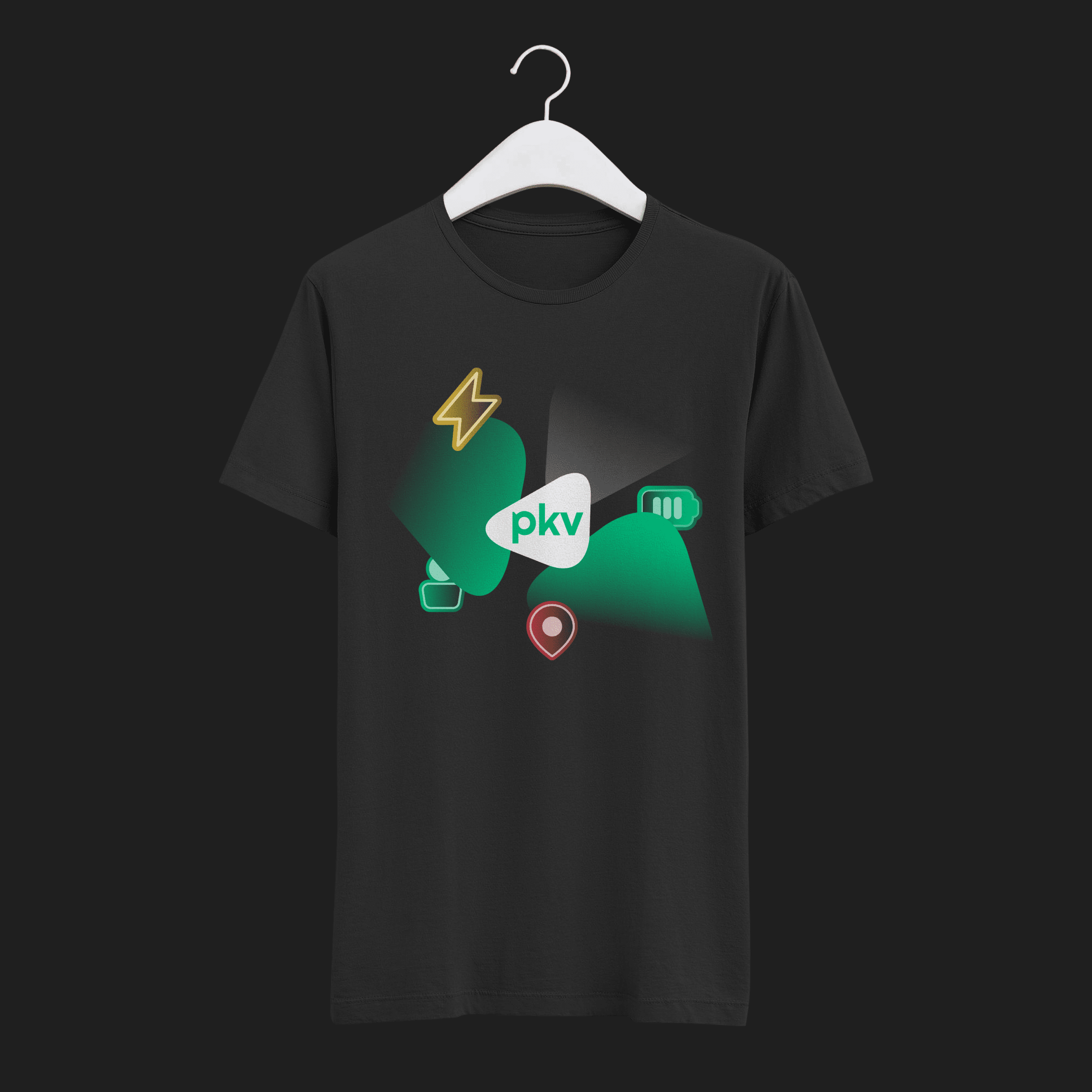
Not a Drawer Identity
We followed up the extensive brand manual with a social media kit to cover every scenario. And we left nothing to chance in offline communication either. PKV socks? Why not!
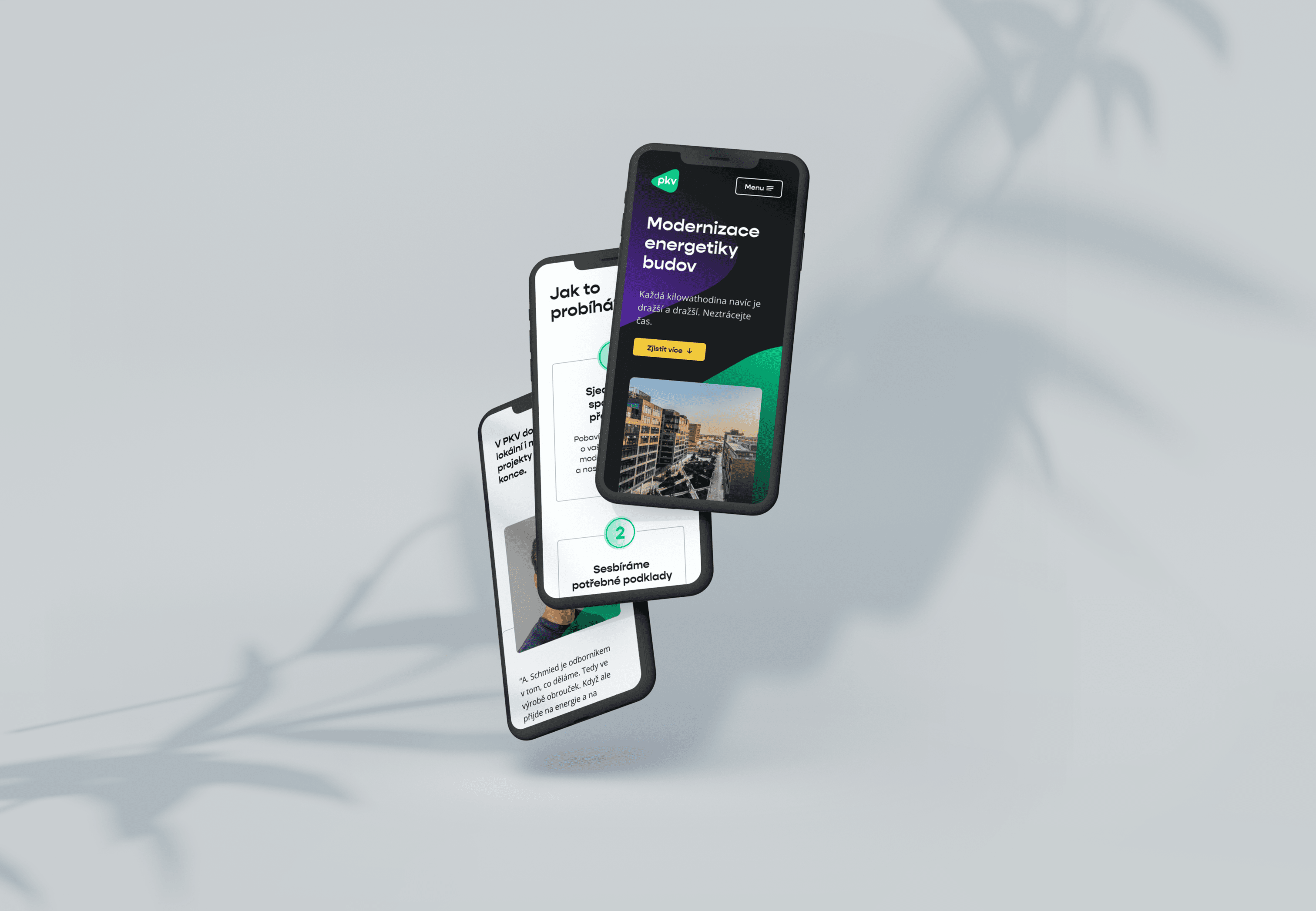
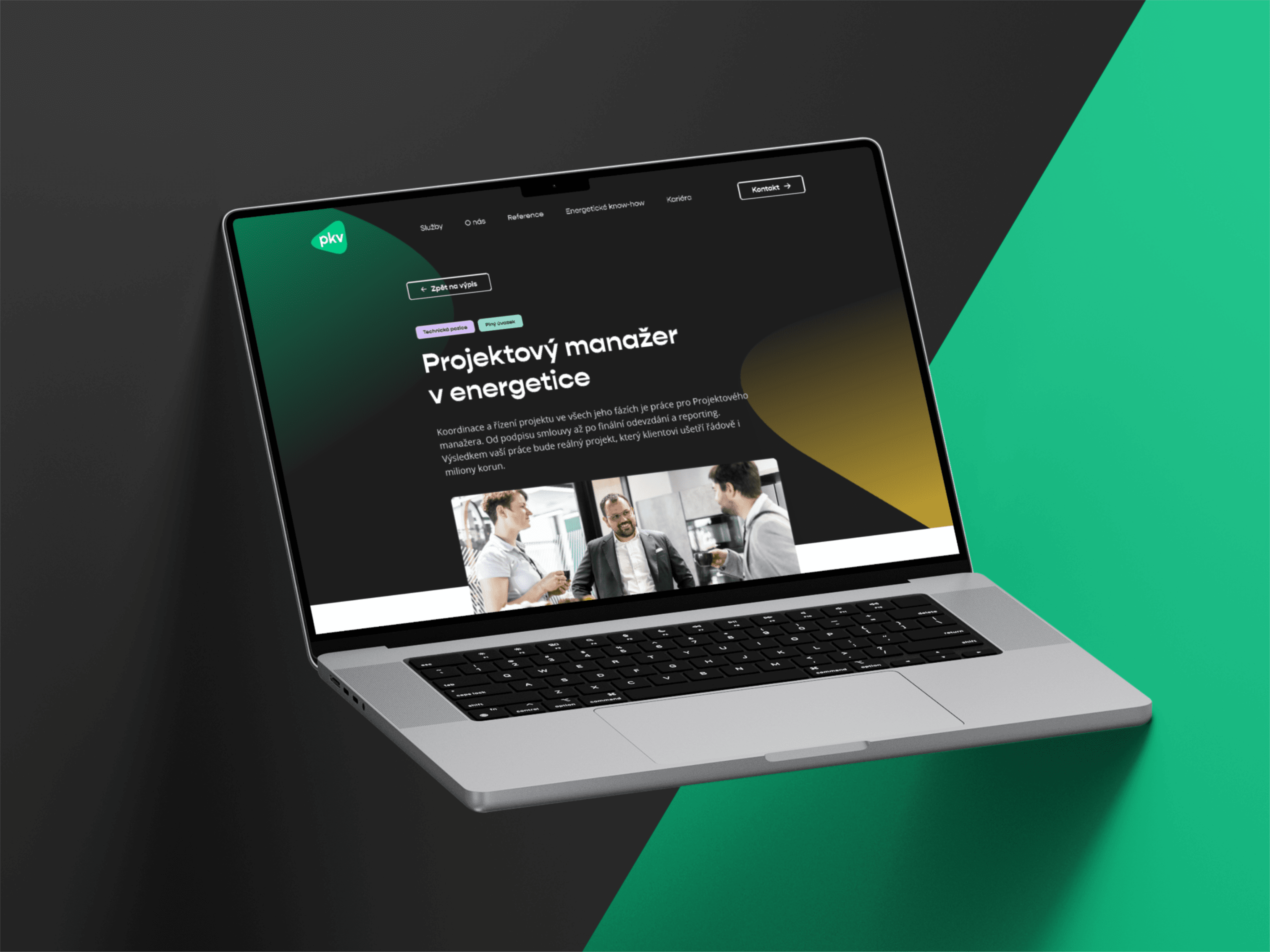
This rebranding has really translated everywhere. Including – obviously – the showcase of any business of our time – the web. Open the site, and you have a recognizable, strong, and confident brand in front of you.


