4rail
fine tuned
trains
- Branding & print
- Webdesign & webcopy
- Strategy

4rail is a family-owned company based in České Budějovice, dedicated to repairing, renovating, and modernizing rail vehicles. Whether you imagine a modern EC, a locomotive from times long gone, or a freight car carrying hundreds of shiny automobiles, none of that is a problem for these pros. The core of their business is repairing, upgrading, and maintenance of all types of trains. Their goal has been to uplift the brand communication to current standards. So we set out on the rails to strategy, rebranding, and creating a new website.
We wanted to experience a hall full of trains
Right at the first meeting with Michal Ovsjannikov (CEO of 4RAIL), it was clear that we wouldn’t be able to do it without going to České Budějovice in person. During the two-day workshop, we witnessed various stages of the renovation and how carefully 4RAIL approaches them. We walked through historic carriages from the 20s and 30s, sleeper cars, and saw how sandblasting or precise paint work is done.


It’s a men’s world
This is the way it is, according to the 4RAIL’s management. And we soon discovered their target personas were all men indeed. With that in mind, we defined the pillars of the brand strategy.
We followed with the analysis of the competitors’ websites and discovered a remarkably monotonous world. Almost all the companies used the same language of colors, with no attempts to stand out. We took a different path. We wanted to let website visitors know that they’ve got something to do with nice guys who understand their craft and business and are not afraid of personal communication.


Train associations
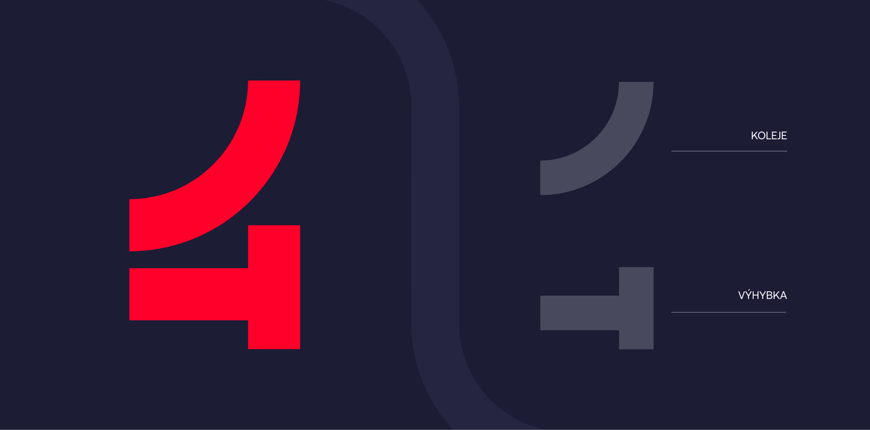
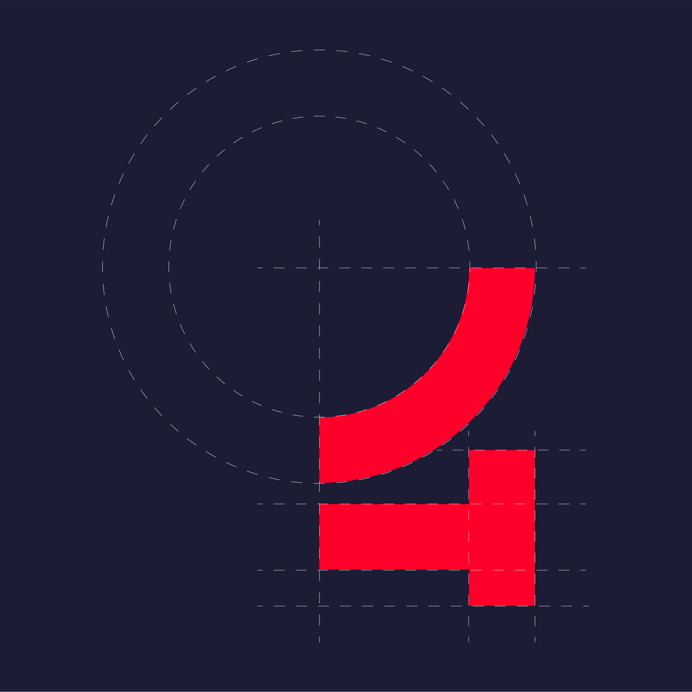
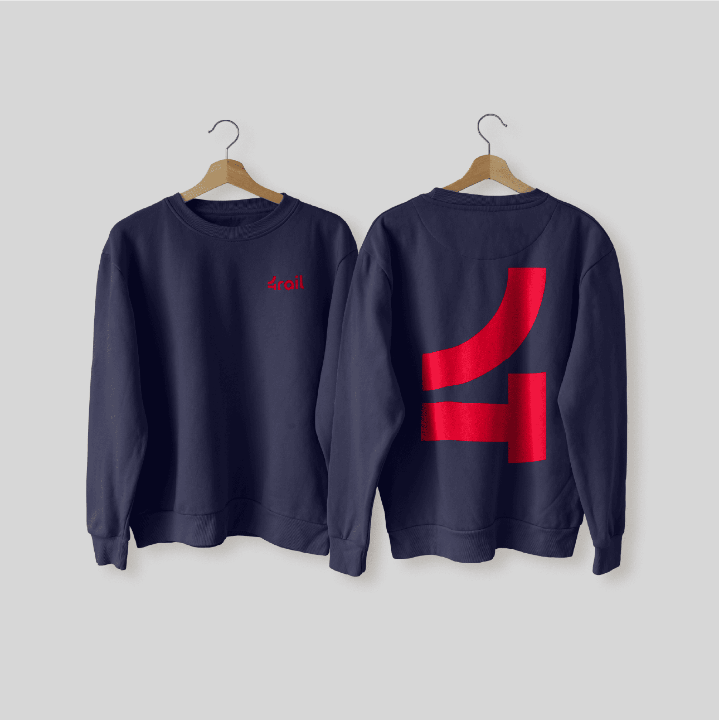
Koleje a výhybky nás provázely celou tvorbou. Od prvních designérských náčrtů, přes wireframy, až po výslednou podobu webu a brandu. Proto je taky naše designérka Vendy využila, jako základní motivy při proměně loga i dynamických prvků webdesignu. Zaoblené tvary vycházely z číslice 4 a staly se praktickým elementem, použitelným nejen online, ale i při výrobě offline materiálů, které lze využít na konferencích nebo expozicích.


Let’s keep red
The red color dominated the original brand. Keeping it in the new visual identity was one of the few client’s requirements. We only transformed the brick red to a more vibrant shade. Then we added two complementary basic colors – coming up with a red-blue-white identity.




Dark or light website?
Most of the competing sites follow the same pattern. A plain website on a white background without much creativity to show. That’s why the client was initially also
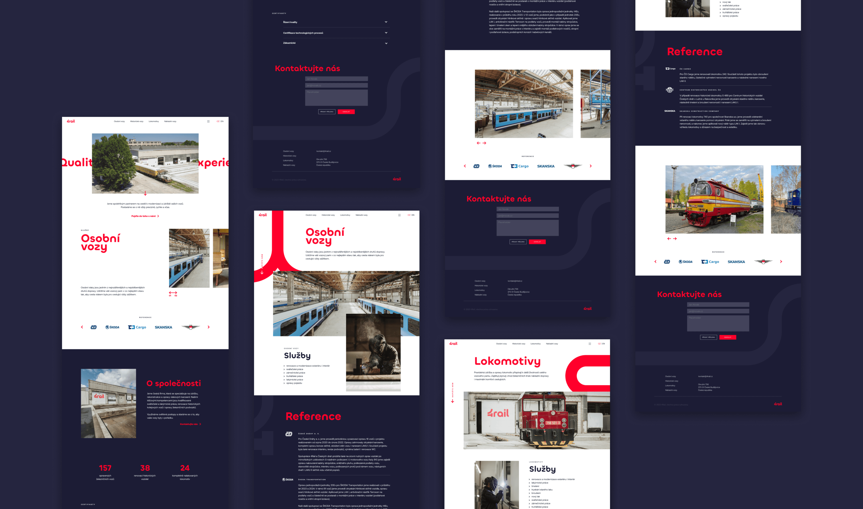
Most of the competing sites follow the same pattern. A plain website on a white background without much creativity to show. That’s why the client was initially also leaning towards the dark blue background. However, we did not advise to do so completely and had to point out the problematic nature of the dark variant. Through joint discussion and shifting of the original proposals, we managed to find a compromise. The website’s on a white background, which smoothly transitions to blue in some sections.

Emphasis on UX and UI
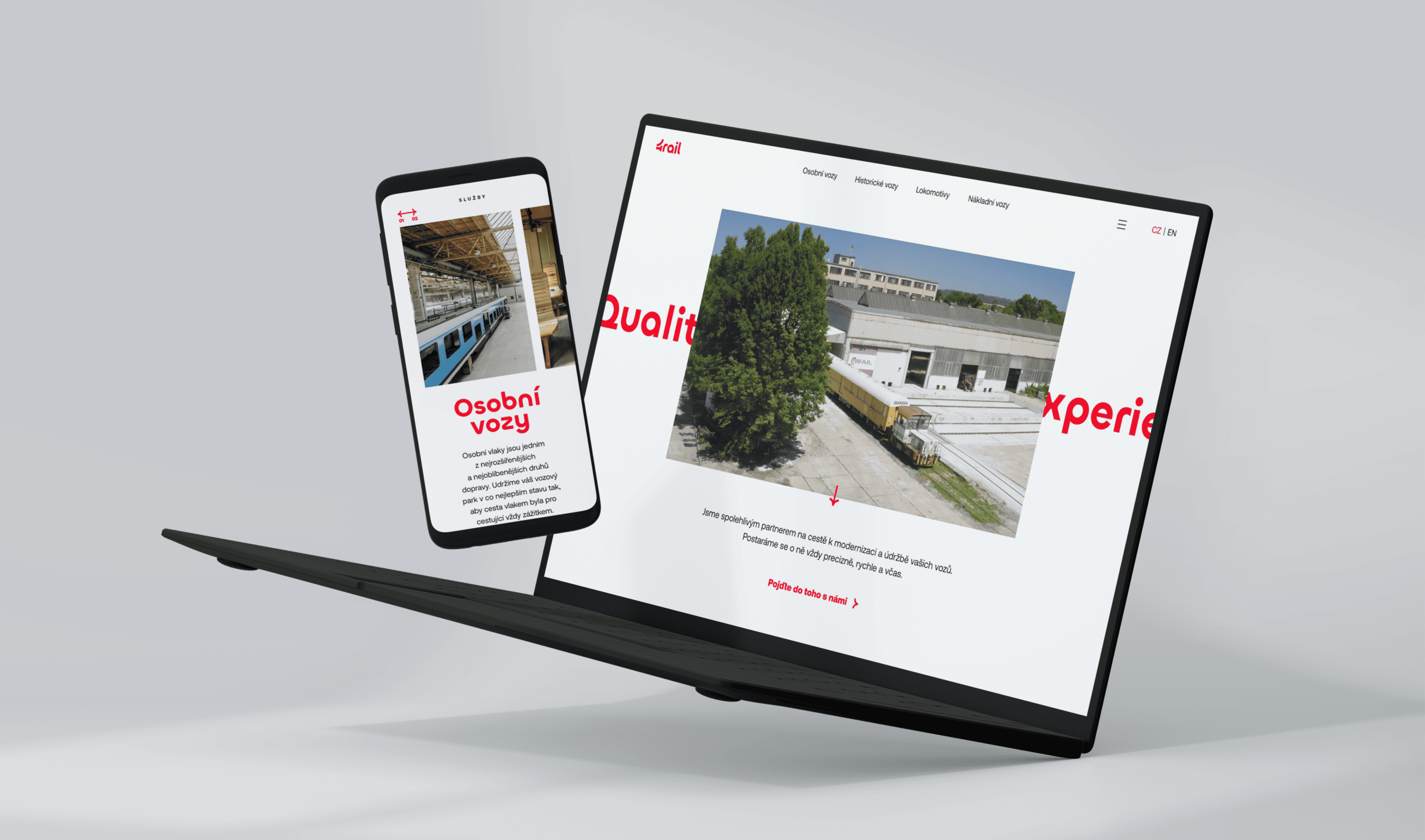
A website where you can quickly find what you need. We designed individual pages so potential customers can immediately find the relevant information, and key references, and conclude the visit with a swift inquiry. We added animated elements, emphasizing the main call to action. And a dynamic website was born.

Interesting numbers have their place on a website
Although 4RAIL is a family-owned company, they can prove they’re delivering great jobs. We paid good attention to sharing success stories. We show photos and cover how repairs and renovations have been carried out for companies such as SKANSKA, Czech Railways, ŠKODA, Bayern Bahn, or Fränkische Mueseums-Eisenbahn.


