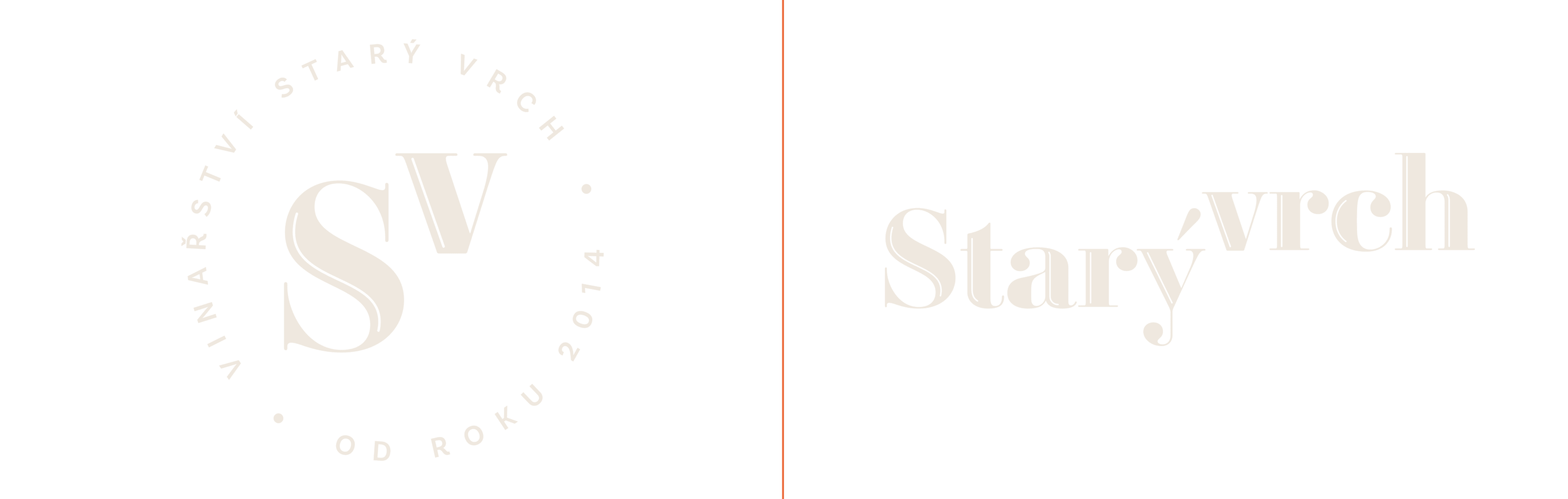
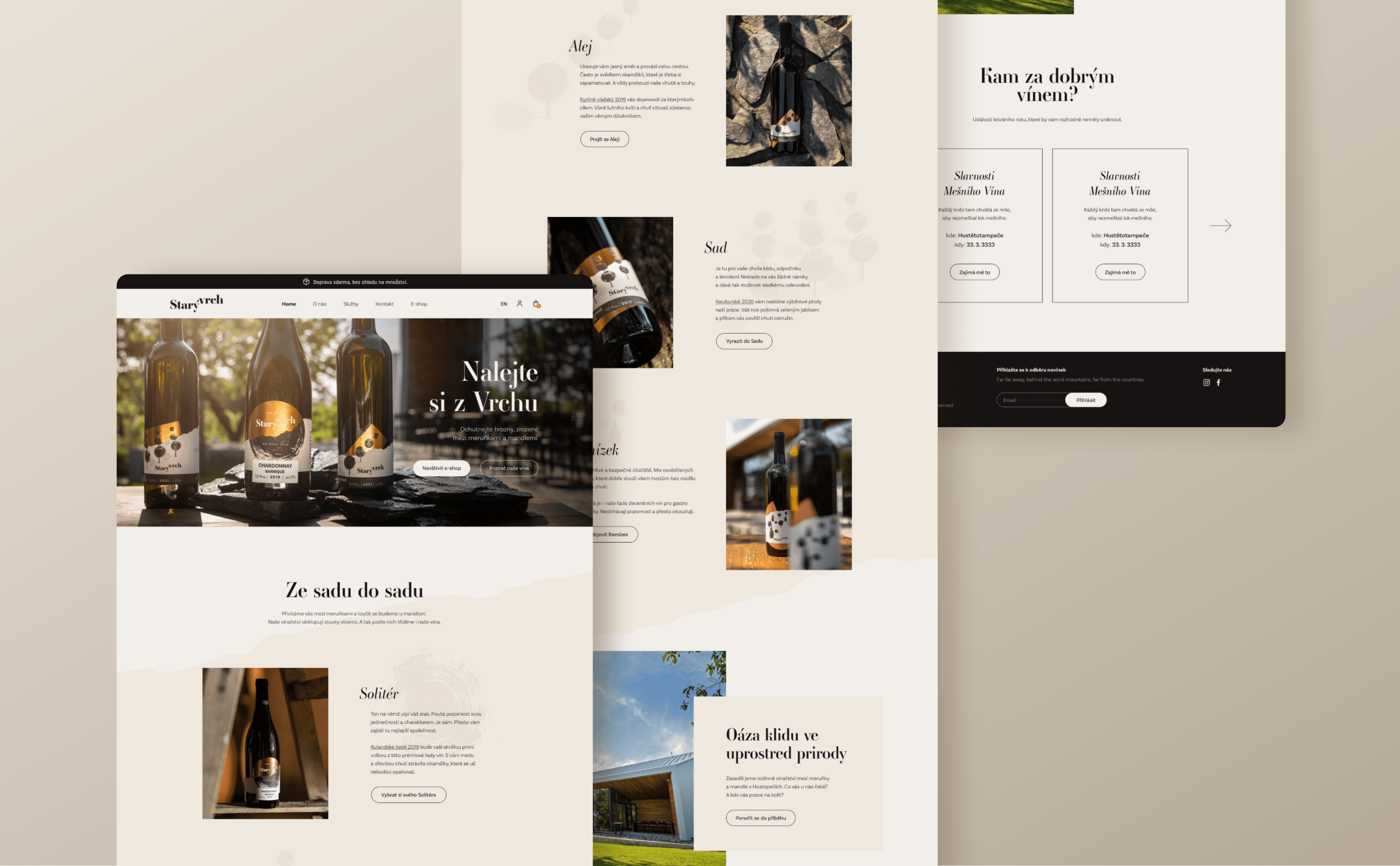
Starý Vrch Winery
Pour it
from the top
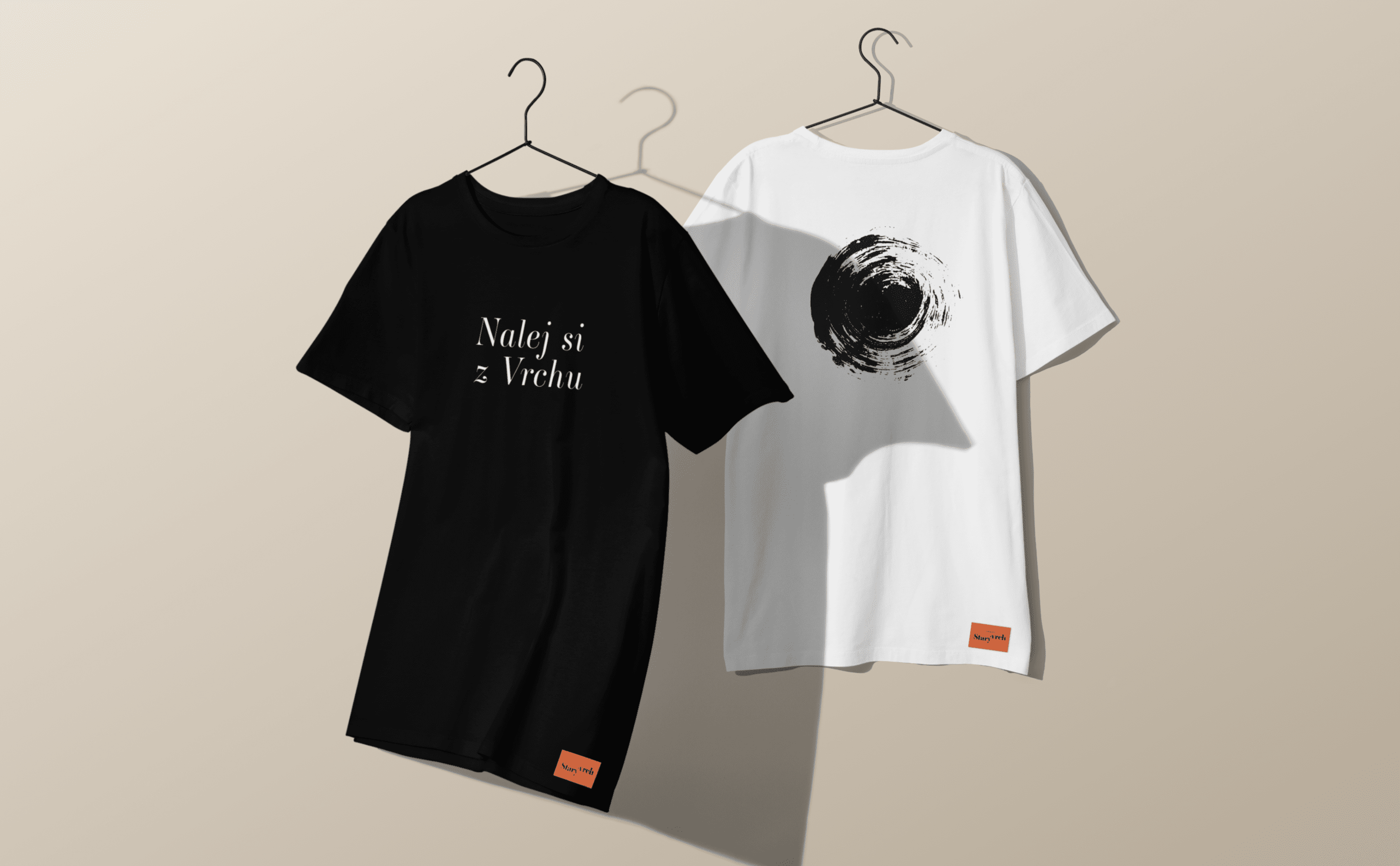
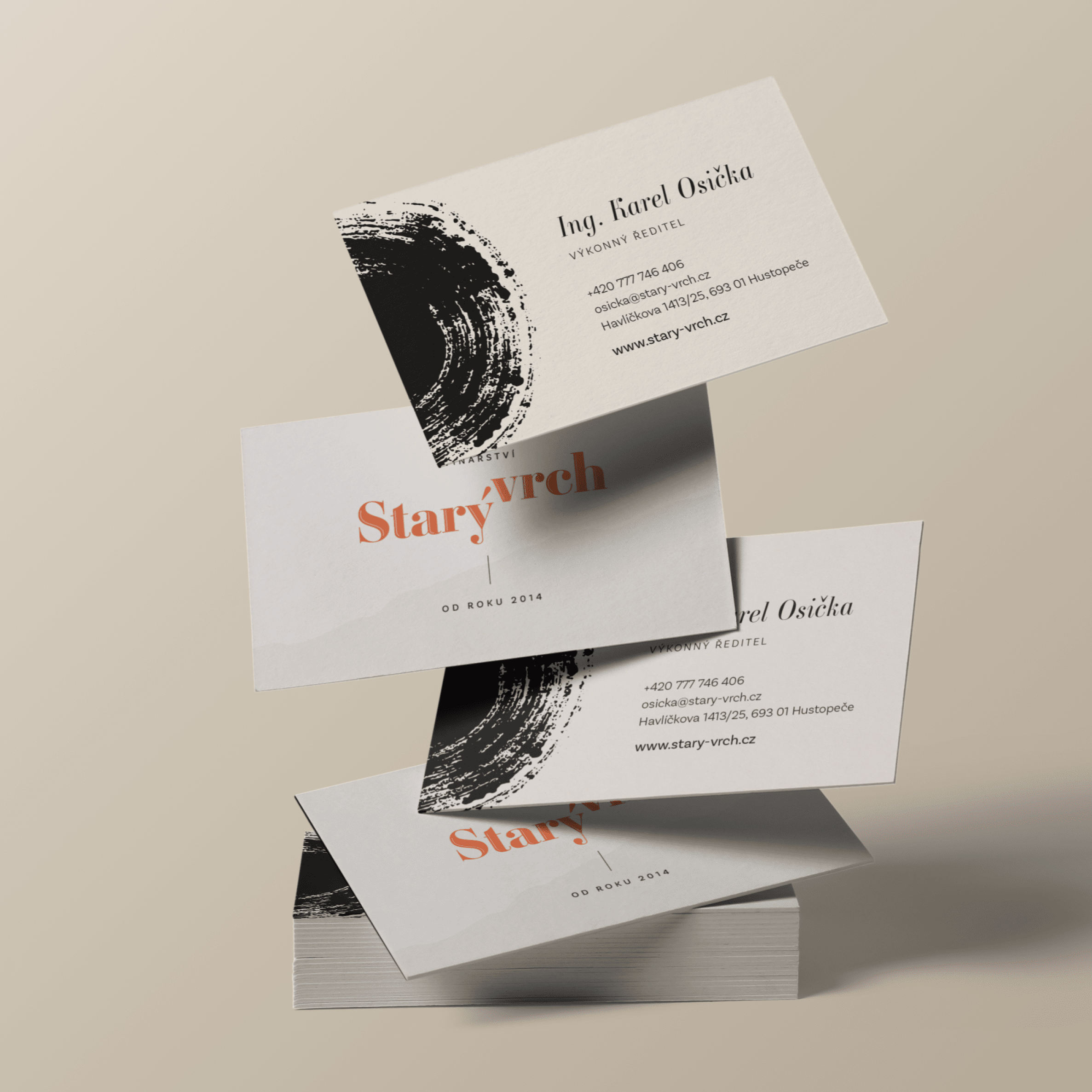
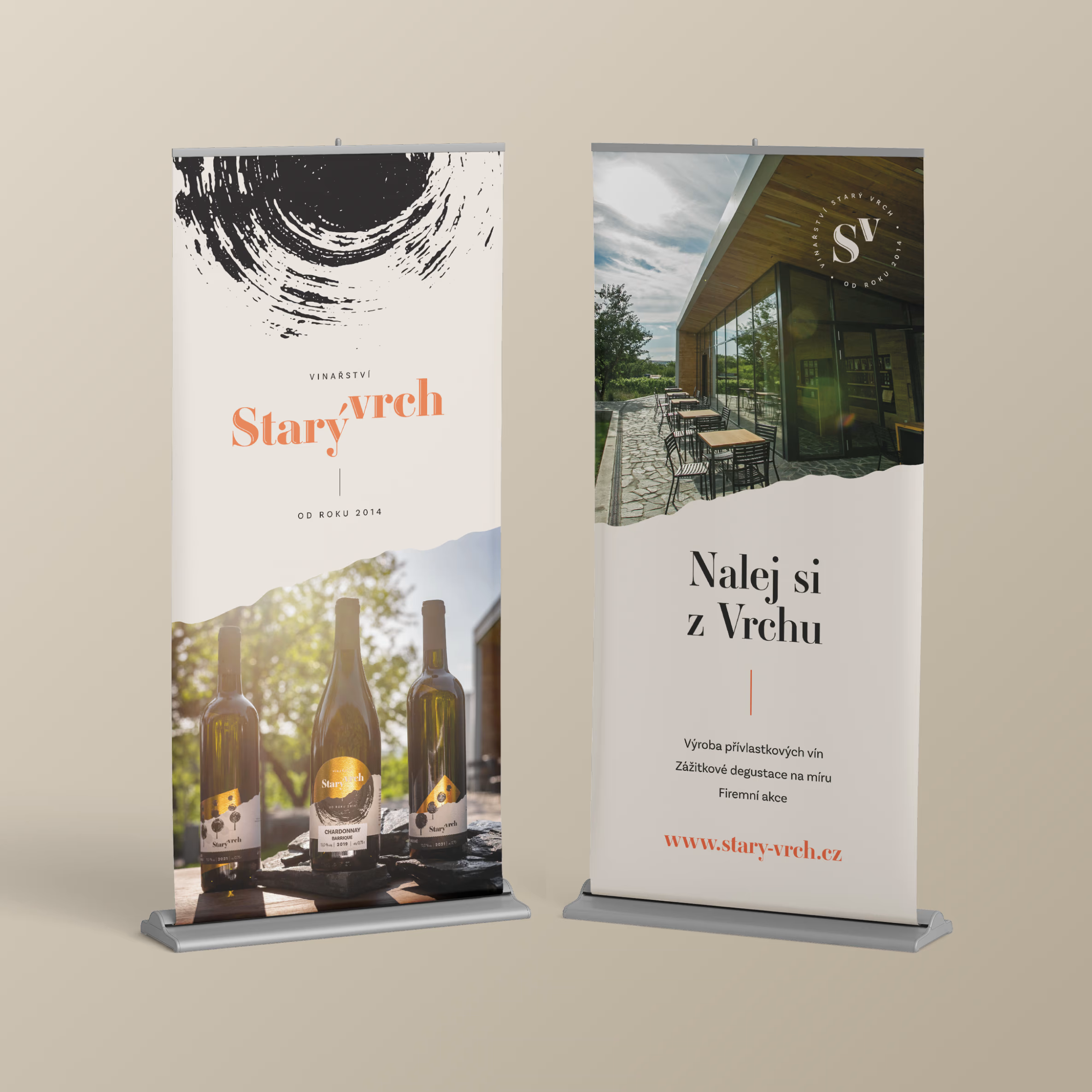
- Branding
- Packaging
- Website
- Copywriting
- Photography

To come up with an identity for a winery, to be reflected across the entire brand communication. From bottle labels to e-shop.
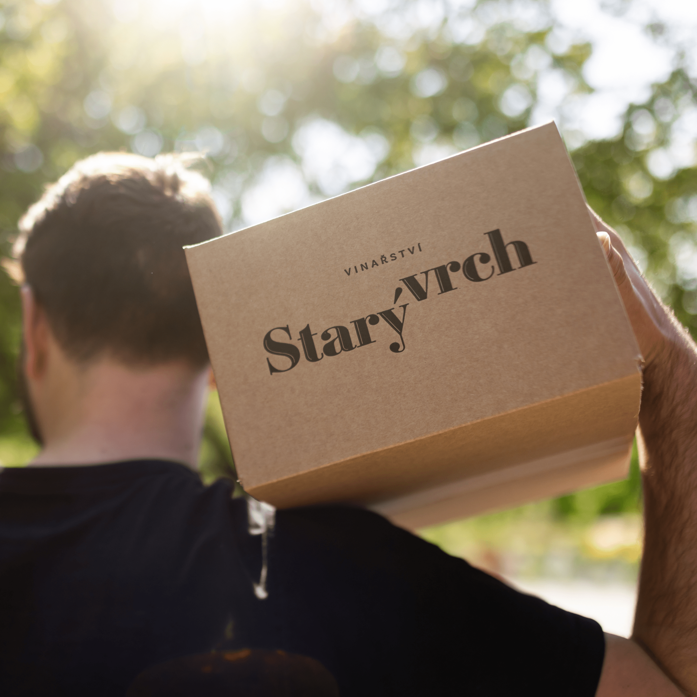
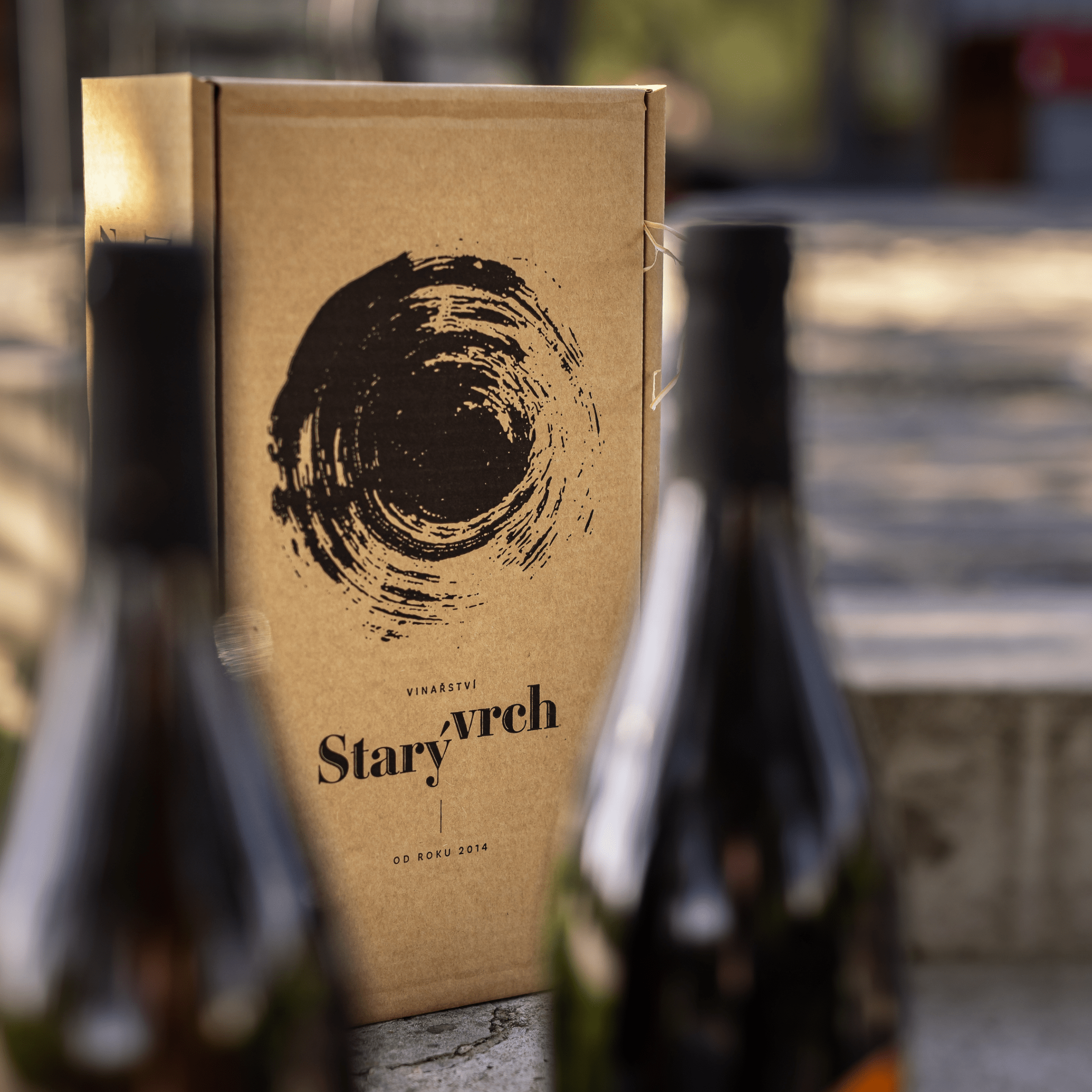
Brand, packaging, web.
We built everything on the central motif of trees and the journeys they take us on.

From orchard to orchard with a paintbrush
Hundreds of trees surround the Starý vrch winery. Almonds on one side, apricots on the other. Thanks to them, the place has such a genius loci that we could hardly find a better leitmotif at the bottom of a glass.
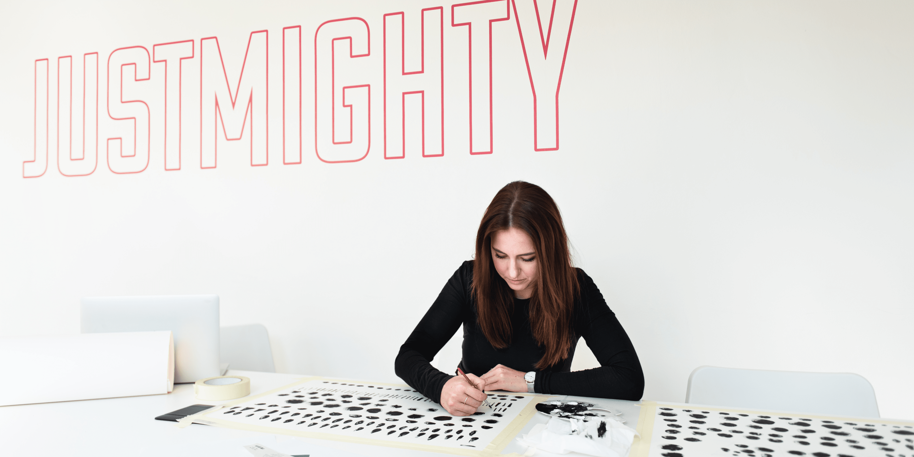
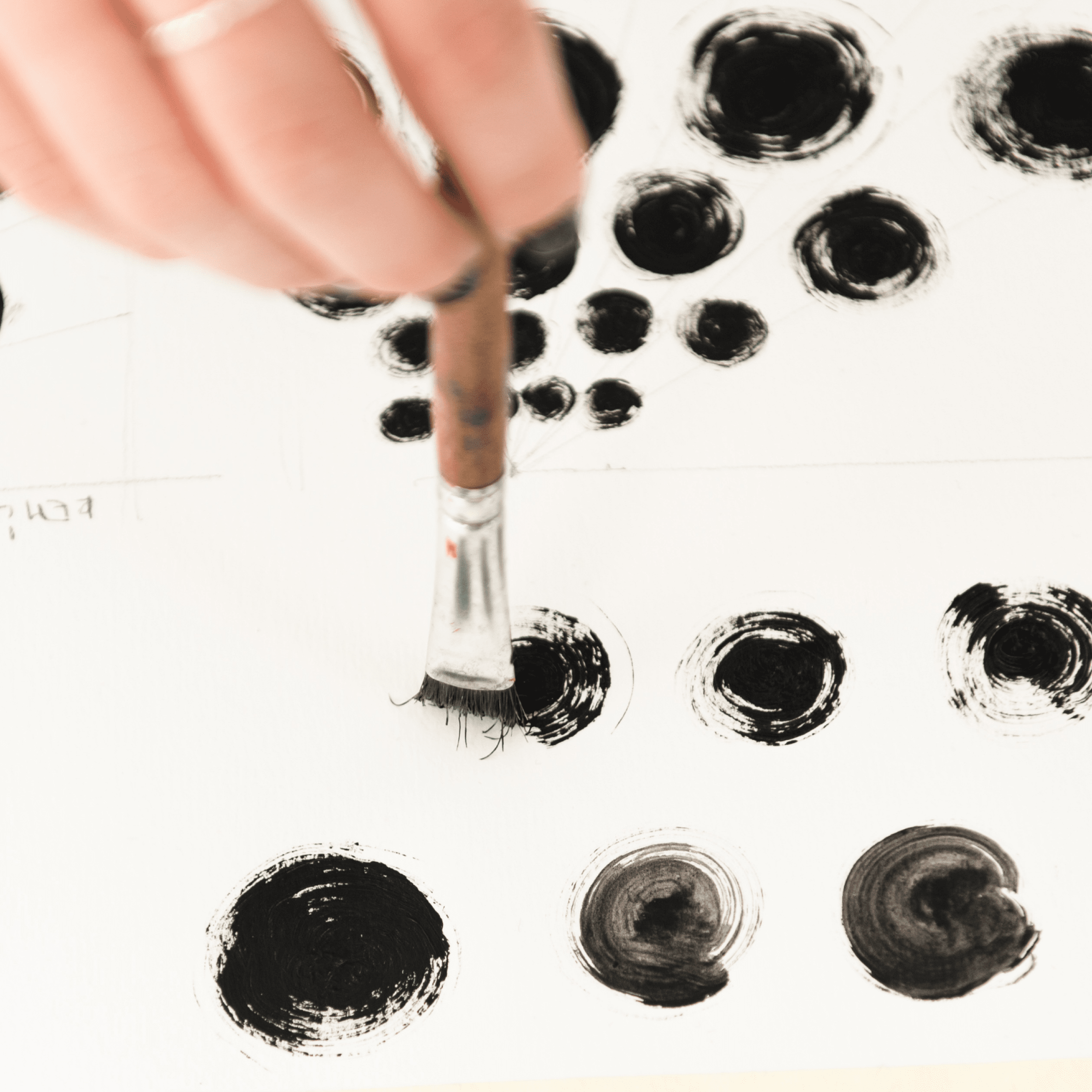
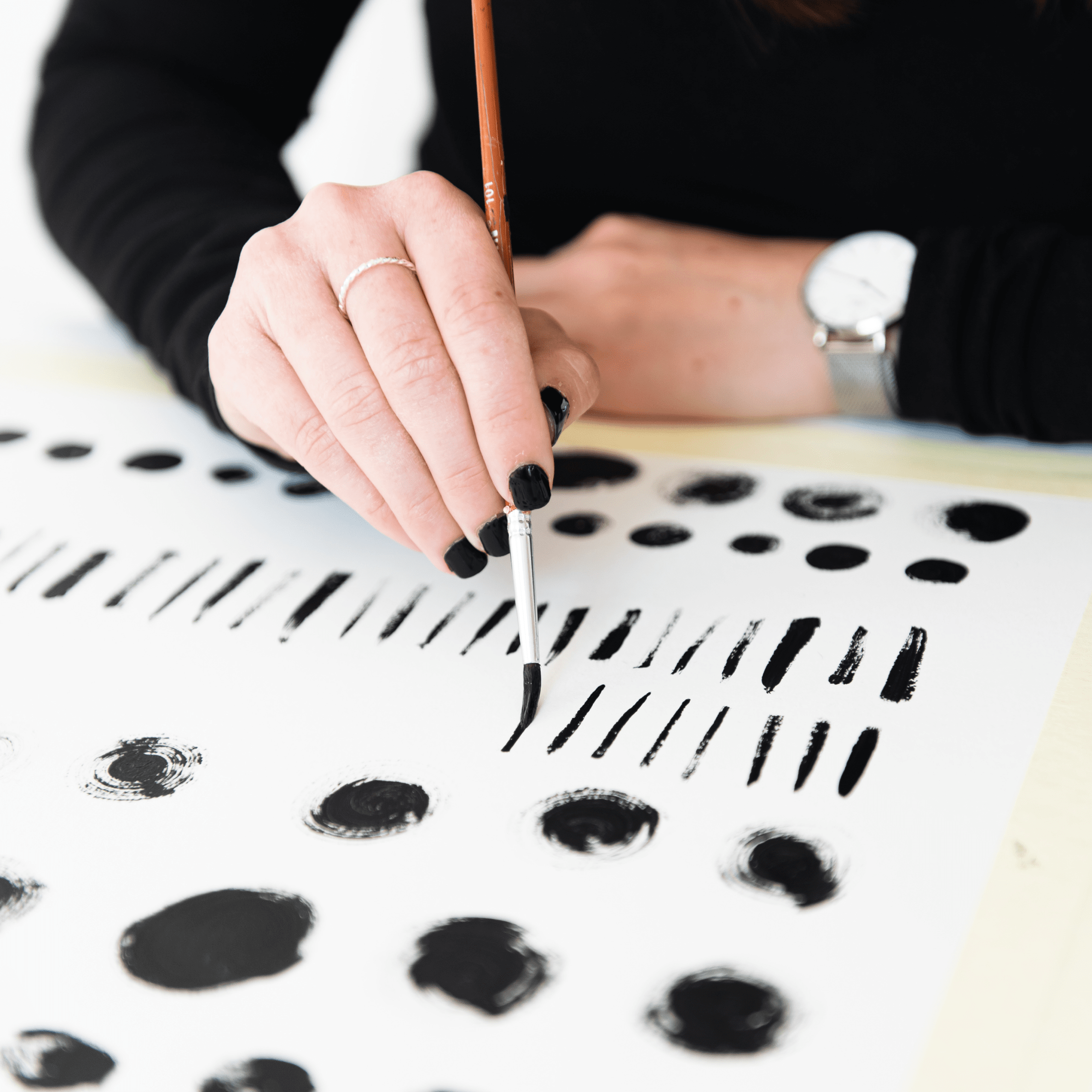
Our designer felt that the digital space wasn’t the right choice for starting the illustrations. She wanted to get something more intimate into the brand. Something that captures with greater feeling the atmosphere that permeates you when you sit down with a glass of wine in the shade under the treetops in Hustopeče.
So she decided to pick up a brush.
Time among trees
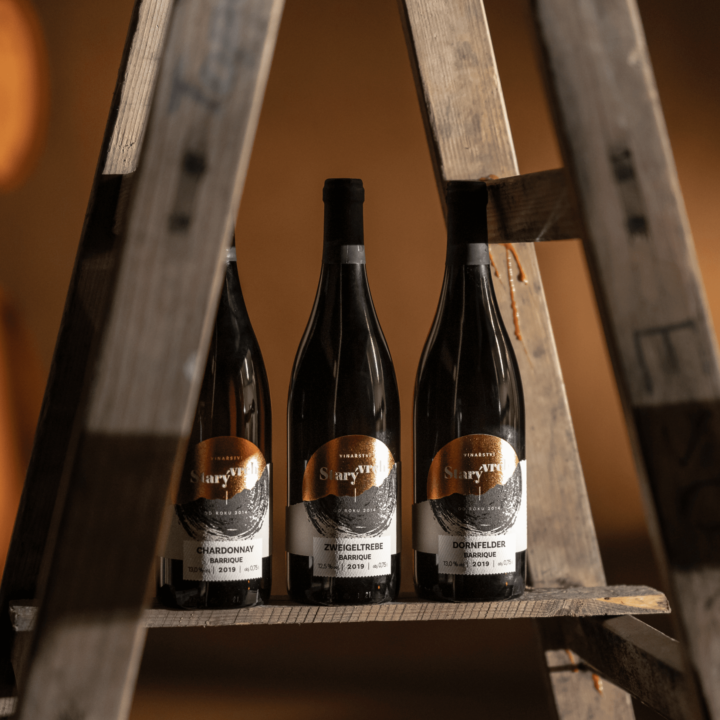
We needed to shape the identity so it would fit 4 different quality and price classes of wines. We have therefore elaborated on the idea of trees and divided them according to groupings they form. As a result, the names of the wine ranges came about: Solitaire, Avenue, Orchard, and Thicket.
Our copywriter then wrote several sentences for each of them, which simultaneously reflect the atmosphere of the grouping, the mood they evoke in visitors, and the character of the wines from the respective series. Additionally, they always introduced a specific wine that best represents each series.

Solitaire
The one that catches your gaze. It captivates attention with its uniqueness and character. It stands alone. Yet, it ensures you the best company.
The Pinot Gris 2019 will be your excellent first choice from this premium line of wines. With the scent of honey and a woody taste, you will spend moments that will not be repeated.
Orchard
It’s here for your moments of peace, relaxation, and lounging. It imposes no demands on you, offering the opportunity for sweet surrender.
The Neuburger 2020 will offer you the select fruits of our labor. Your nose will be tickled by green apple while refreshing you with the taste of blackberries.
Avenue
It shows you a clear direction and accompanies you all the way. Often a witness to moments worth remembering. And always awakens our tastes and desires.
The Welschriesling 2019 will accompany you to any destination. The scent of meadow flowers and the taste of citrus will remain your faithful confidant.
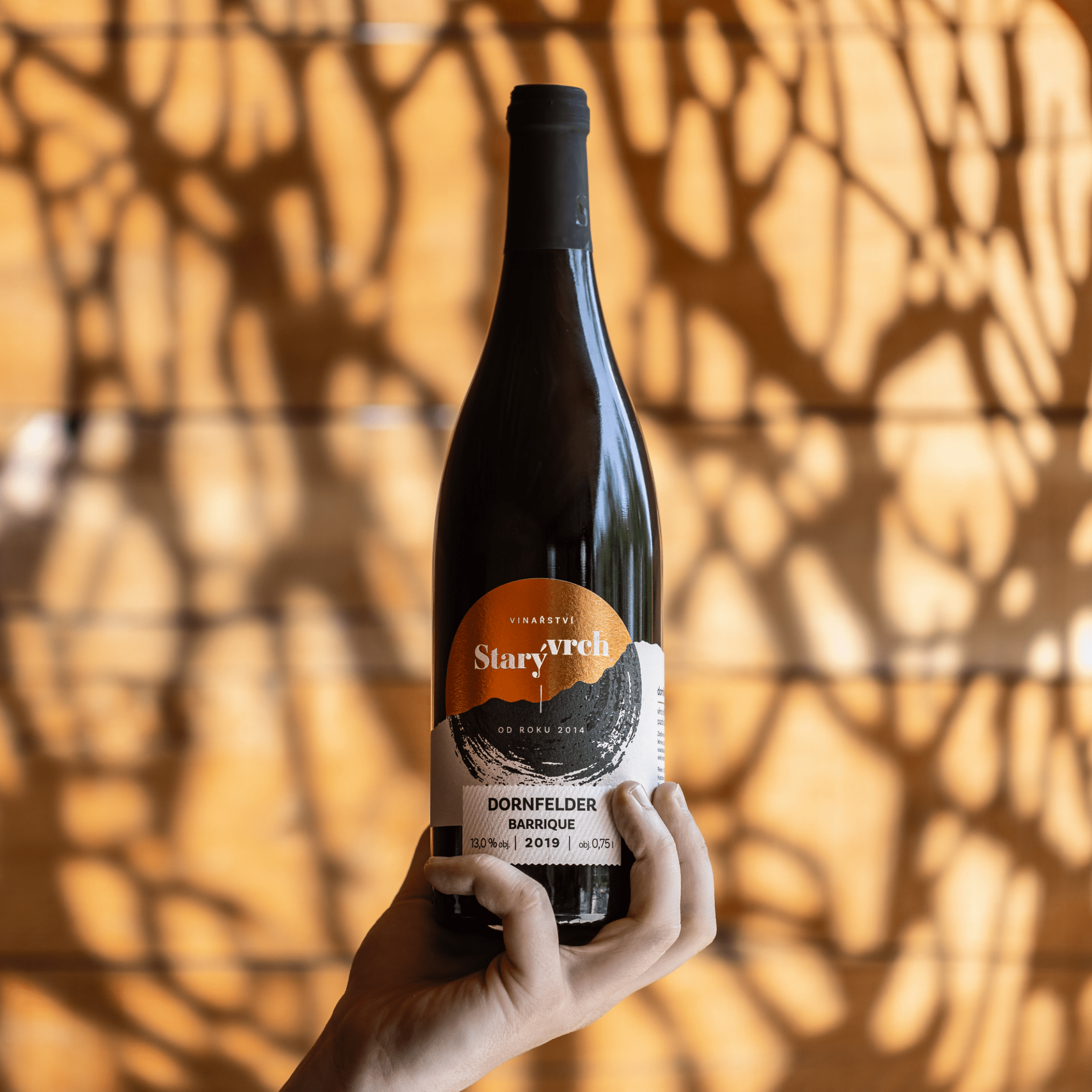
Thicket
A reliable and secure refuge. A blend of proven varieties that serve all guests equally, regardless of their scents and tastes.
Such is our range of subtle wines for gastronomic establishments. They don’t attract attention and yet they enchant.
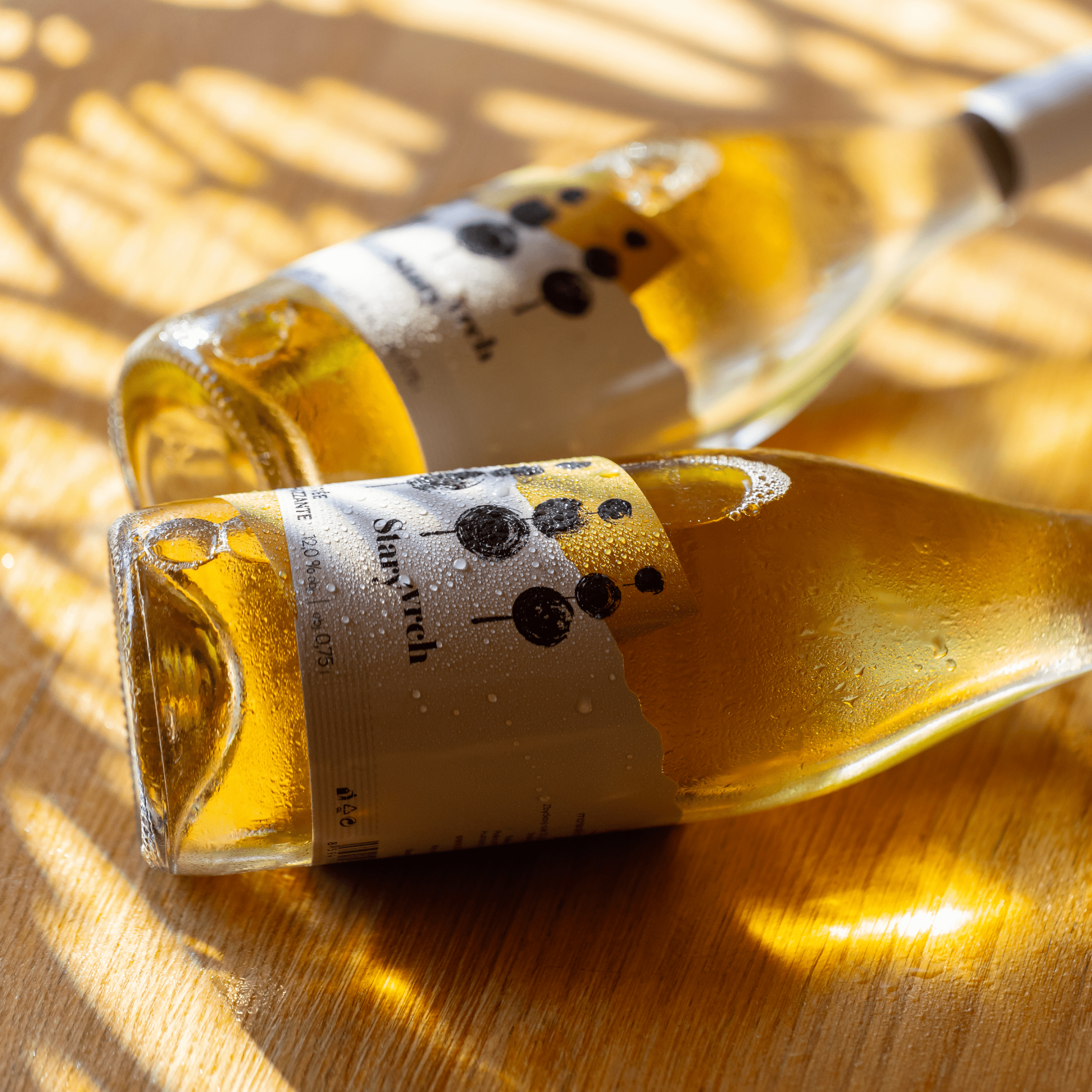
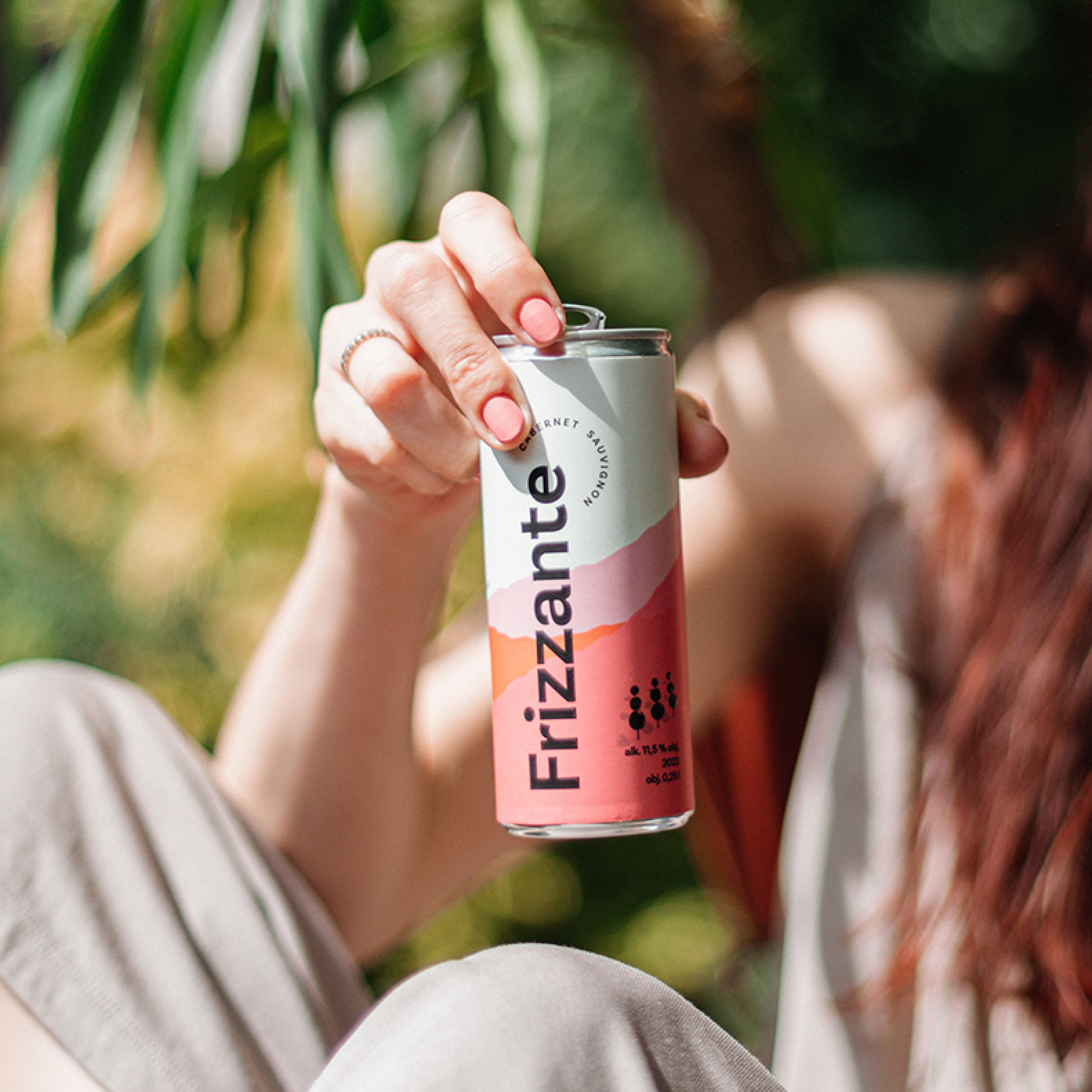
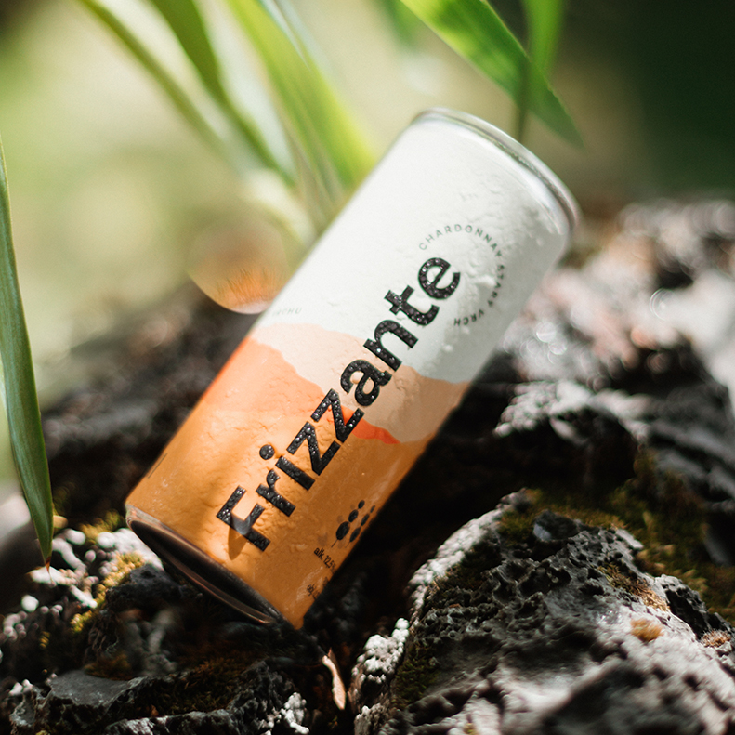
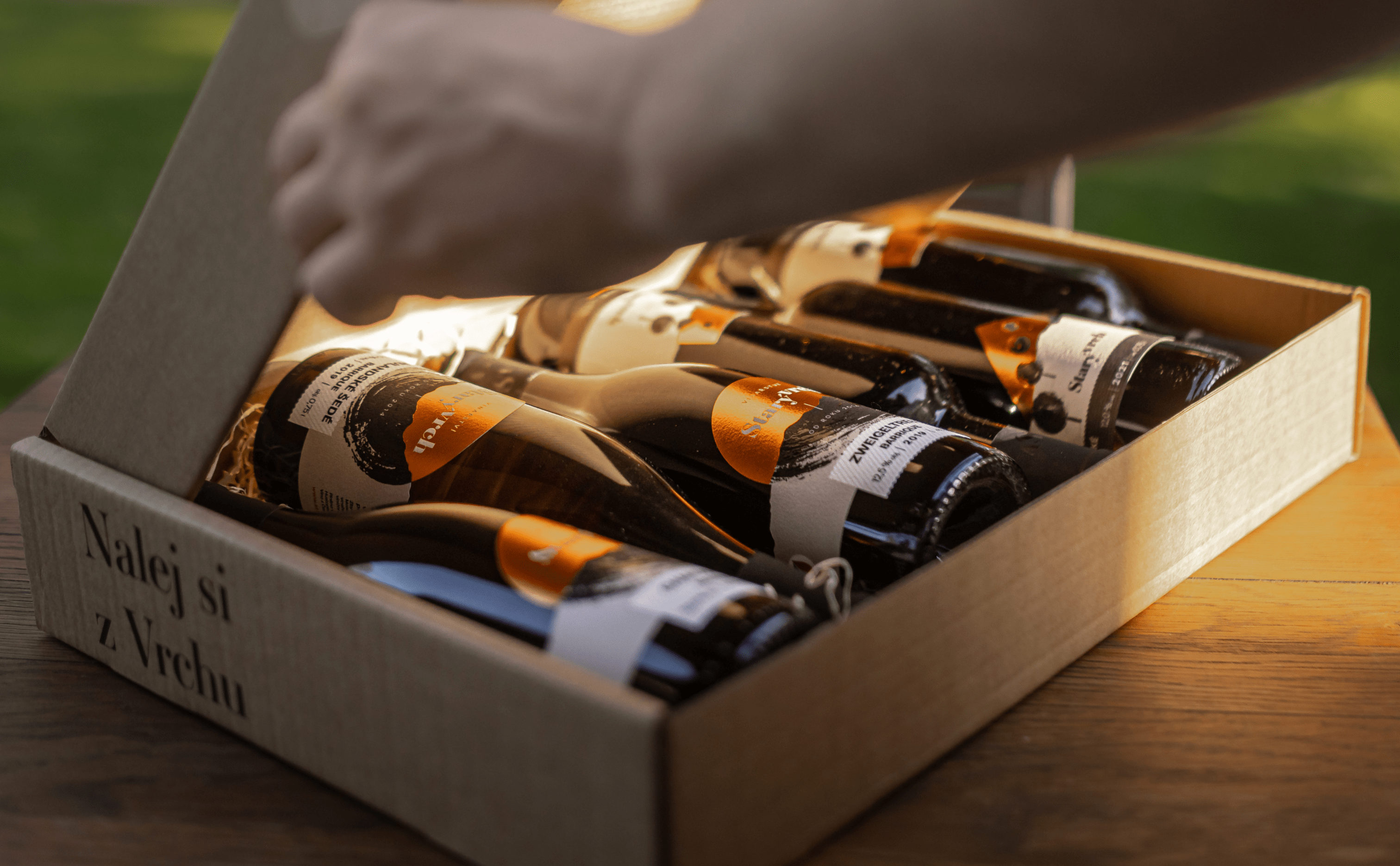
In 2023, the winery expanded its beloved Orchard line with two refreshing canned Frizzante varieties – Blaufränkisch and Chardonnay. The labels were our job again. We drew inspiration from natural elements seamlessly integrated into the overall brand.
All wine labels in this range are decorated with a natural beige bronze design with paper backing and metallic foil. For the Frizzante cans, however, we wanted to energize the design so freshness and color could radiate from afar. Therefore, we chose warmer pink and subtle orange, supplemented with a claim. In addition, we had the ready-made labels printed on plastic so that you can cool this quality juice to the right temperature. Cheers!

Glow of Apricots
In the meantime, designer Verča swapped her paintbrush for a mouse and delved into designing labels, logos, fonts, color palettes, and other applications.
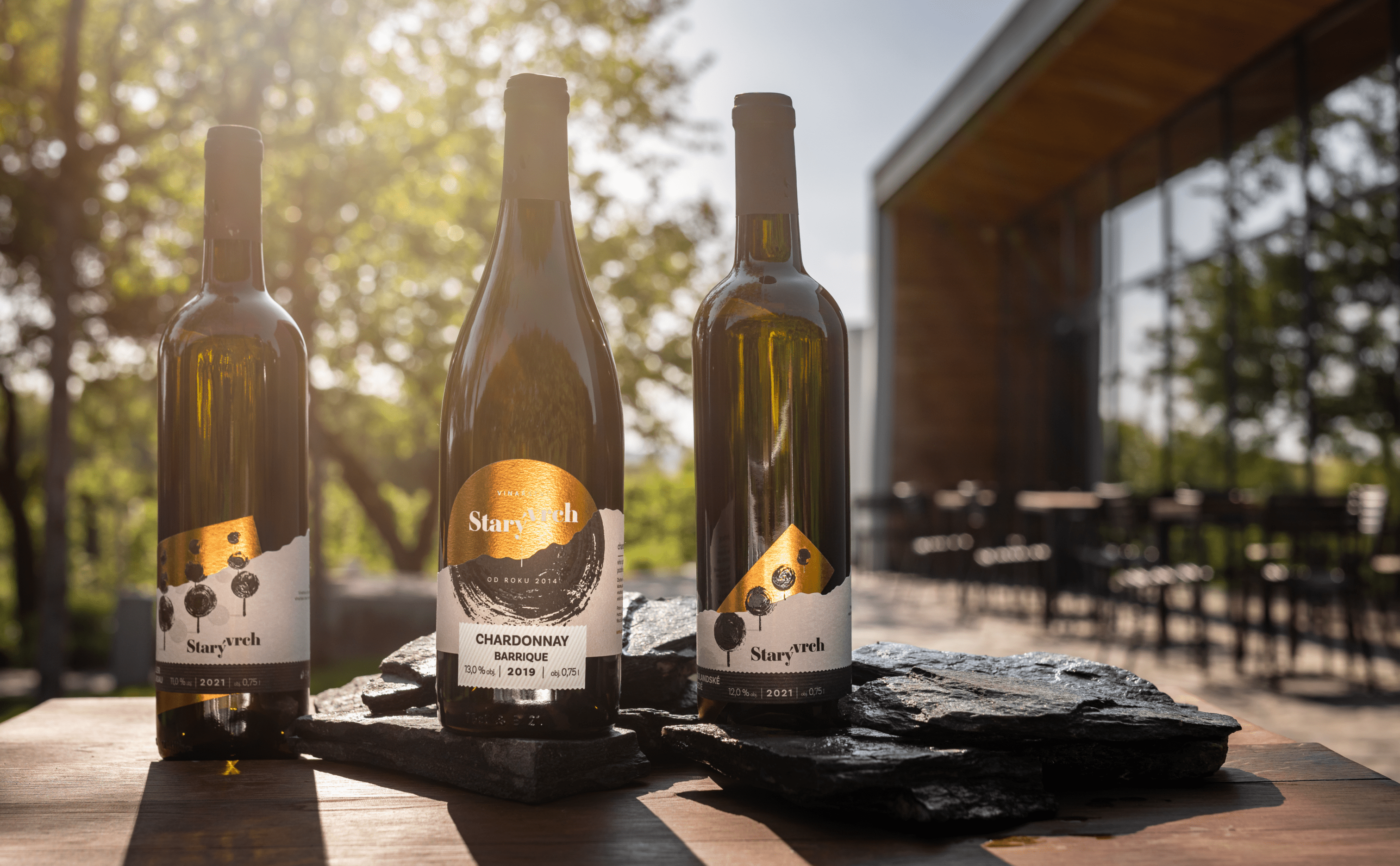
As the primary color, she chose a soft creamy shade complemented by subtle orange, black, light gray, and white. The inspiration for the color palette stemmed from the gentle hues of the evening sky and ripe apricots, creating a contrast with the white facade of the main winery building and anthracite-toned chairs and tables.
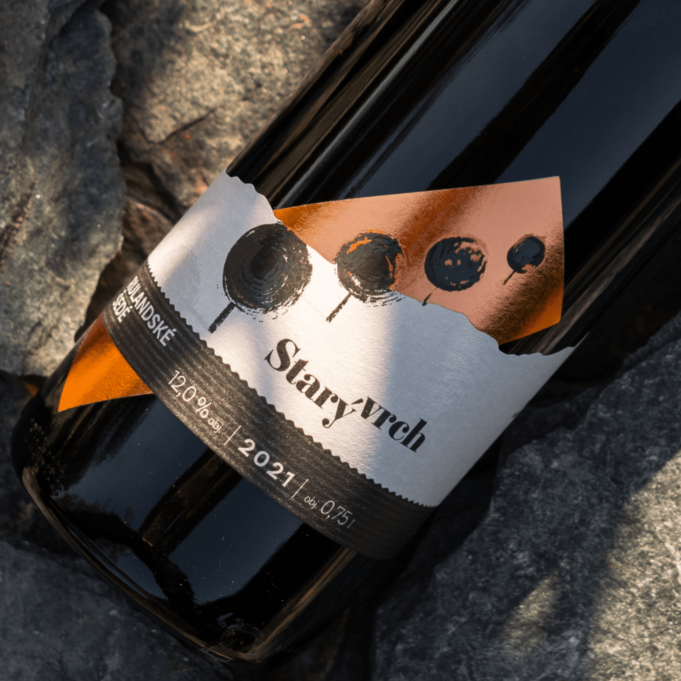
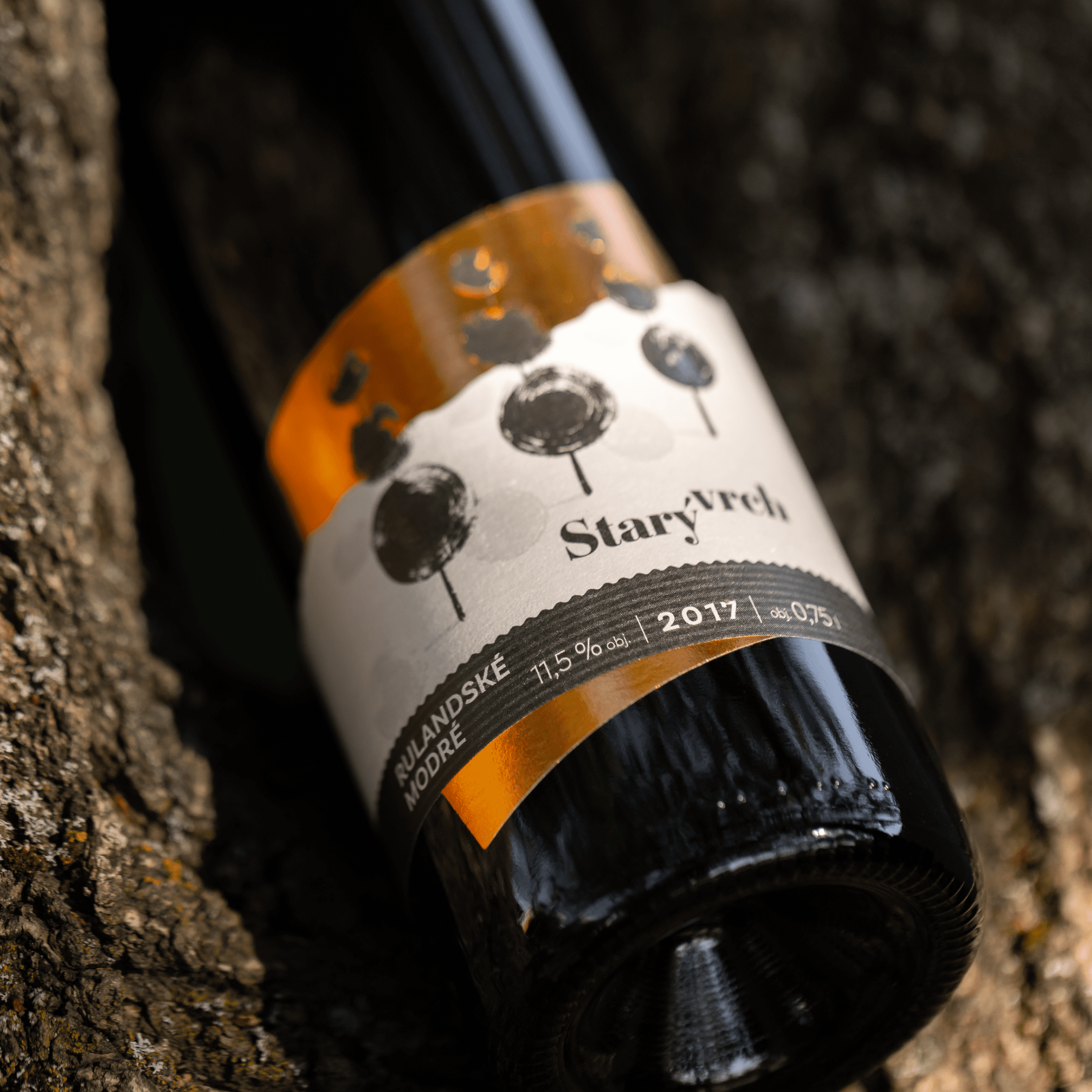
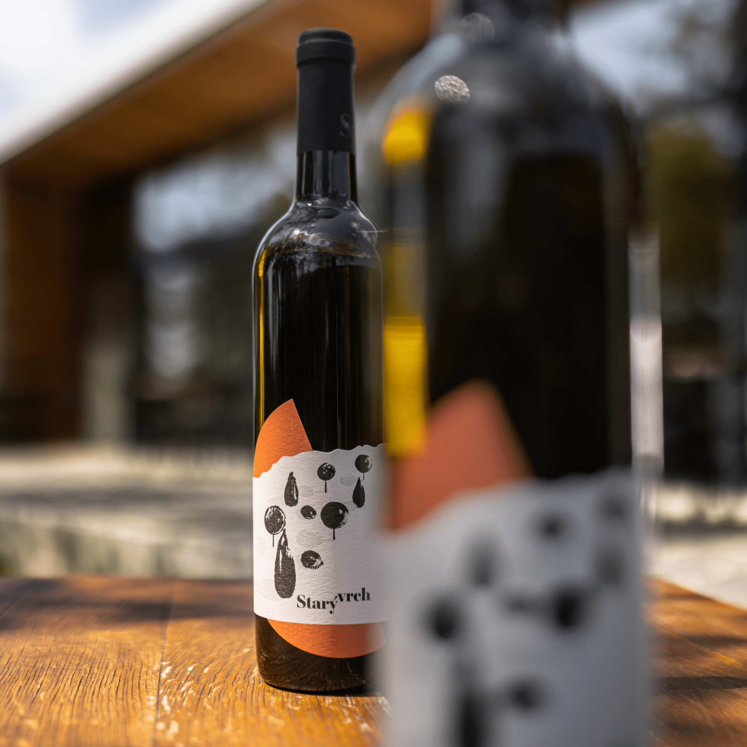
To grab attention with labels on the wine shelves and emphasize their distinctiveness, we decided to design each label for every series in a different shape. These distinct elements are then always combined with an irregular relief resembling a hill and a brush-drawn grouping of trees. Symbolically, she incorporated an elevated terrain (‘vrch’ in Czech) into the logo by lifting this word, and thanks to the chosen font, the logo also features a motif of a wine glass reminiscent of the letter “y.”
For the labels, we opted for copper embossed foil, onto which partial lacquer was applied, resulting in a glossy and tactile surface. That makes customers naturally want to reach out and touch the label.
Pour it from the top
We encapsulated the entire brand identity with the tagline “Pour it from the Top,” which subtly combines a reference to wine and the origin in the winery named after a landmark peak.
Similarly, we played with other claims and the entire copy on the website:
- We mature in Hustopeče
- 11 hectares of Moravian gold
- Grapes born among apricots and almonds
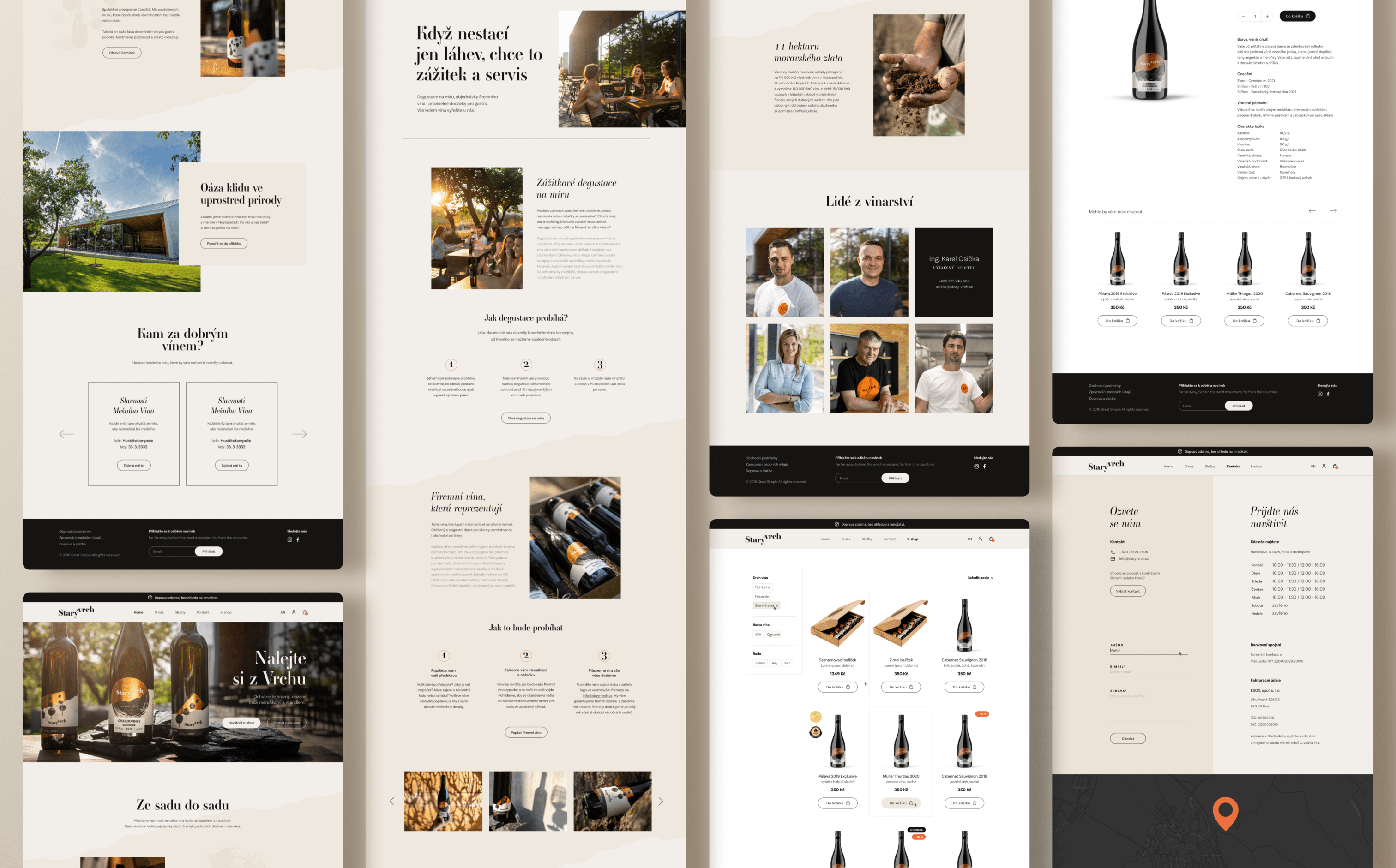
Web and e-shop
transformation
For the website, we designed the architecture and layout, wrote the complete copy, and took promotional photos. As part of the e-shop design revisions, we significantly streamlined the offerings, devised filter logic, and redesigned product cards. We also crafted original product descriptions for each wine:
Color, aroma, flavor
- Your eyes will be drawn to the golden color with greenish highlights.
- Your nose will be tantalized by the scent of green apple, gently complemented by hints of gooseberry and apricot.
- Your palate will be intrigued by the full flavor of blackberries with undertones of lime and nuts.
The website development was then handed over to the client, who took it under their wings according to their wishes.

“Working with Justmighty on a completely new corporate identity – especially the new labels – was great. I would like to appreciate the approach, willingness, commitment and often the necessary amount of patience of the entire team, without which we would certainly not have achieved such a successful result. Thanks a lot!”
Karel Osička, Managing director in Starý Vrch Winery