herold
We Baked
a Rebrand
- Branding
- Copywriting
- Packaging
- Printed Materials
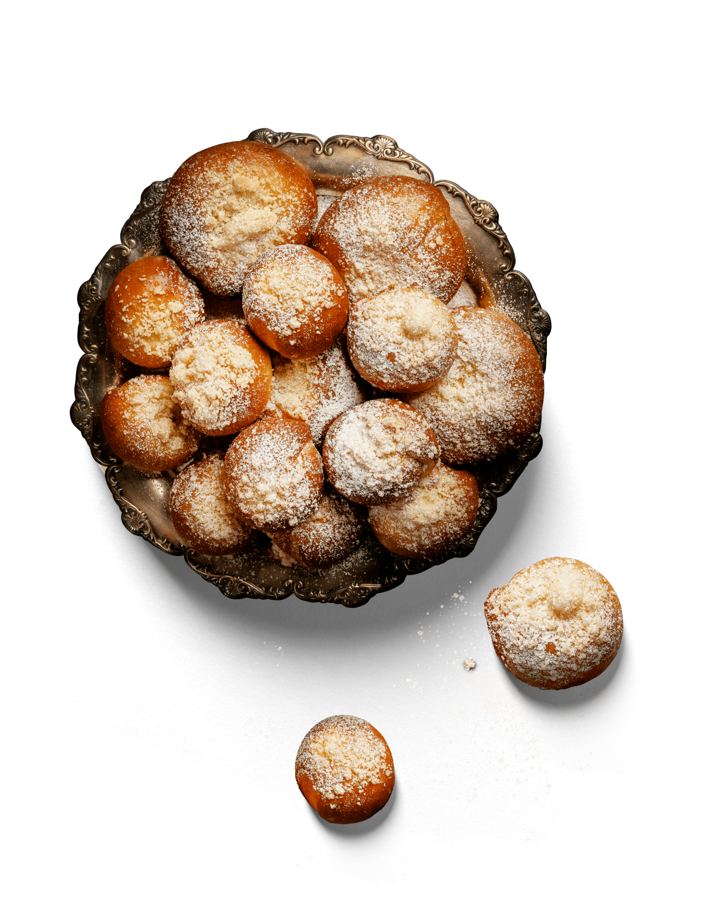
Flour has been milled in Heroltice near Slavkov for centuries, and the love for good pastries is still in the air today, with raw materials supplied by local farmers from South Moravia. We are talking about the bakery with the milling tradition called Herold, who asked us to steer its rebrand.

Herold’s story is powerful!
With milling rights dating back to the 14th century, 100% flour from their own mill, and a reliance on traditional recipes, the Herold brand has a compelling story. But until recently, that story remained largely unheard. We have crafted a fresh visual style, adjusted the copy…and made the story known. The narrative is now being told through storefronts, packaging, posters, and various other forms of advertising.

From Generation
to Generation
”A family bakery with milling traditions” – that’s how we summarized the main ingredients
of the Herold brand. Additionally, we use the image claim ”From generation to generation”. Both taglines refer to the family history. It’s been written since 1890, when the great-grandfather of the current owner, Dita Knichalová, Kondrád Knichal, took up the milling trade. In the second half of the 90s, his grandson established the first bakery.


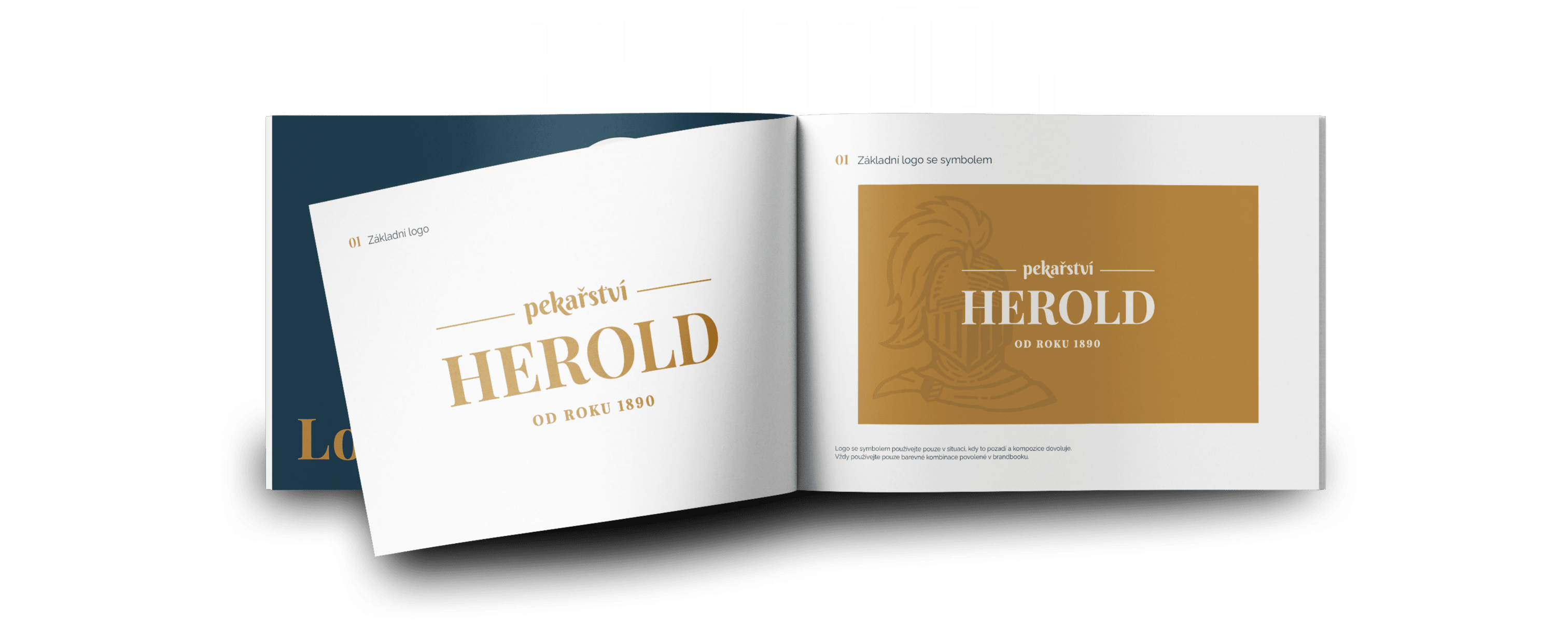
The brand’s identity is deeply rooted in tradition, which forms the cornerstone of the new branding.
The design is clean, modern, yet it still retains a slight patina that perfectly characterizes and complements the brand. The original knight with a spear seemed hostile, which contradicted
the actual nature of the brand and the people behind it.


The bakery inherited its name from the knight Herold.
It was he who granted the miller’s right to the village of Heroltice, where the mill is located. Herold laid down his shield as he no longer needed to defend himself. With the help of graphics and friendly copy, we gave him a more pleasant appearance. Herold serves as a persona that reminds us
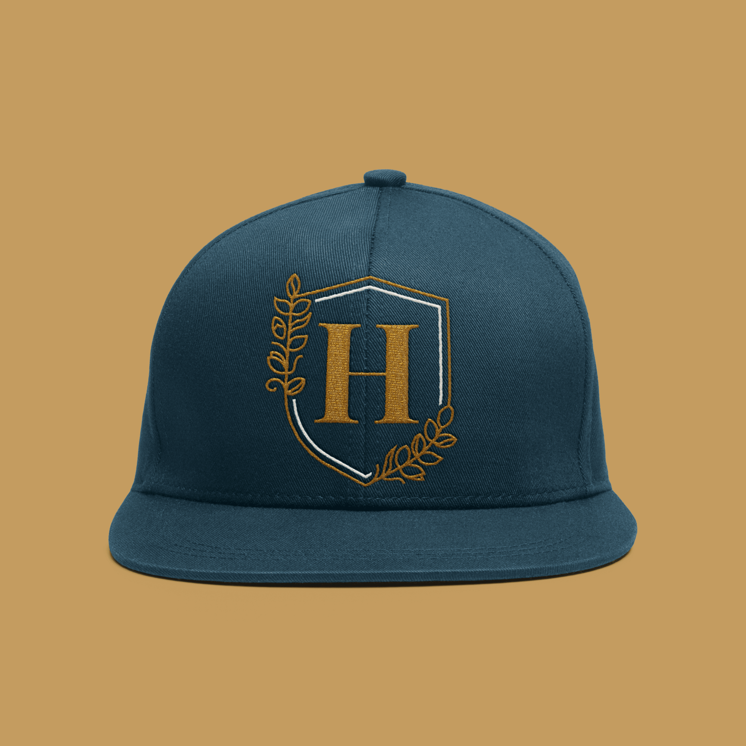
of the origins of the milling tradition. He is a guardian of quality, and at the same time, he makes a welcoming impression. In addition to him, we also use an element of the crest (not the shield) with grain spikes and the initial “H”

Without water, there’s no milling.
The visual identity was previously dominated by dark brown and gold. These colors evoke luxury, and that does not align with the brand’s personality. We have started using beige, white, dark blue, and chocolate colors. Beige symbolizes wheat stalks and bread with a crispy crust. White represents flour. Chocolate colors stand for sweet pastries and desserts. And dark blue signifies water, which is indispensable for the mill.
We use a legible serif font in the logo because it fits well with the traditional brand. As another headline font, we have chosen Berkshire Swash. It is more rounded and flowing, just like Herold’s baked goods. For regular text, we use the Raleway font.

2 Days of Photoshooting,
12 Hours Each
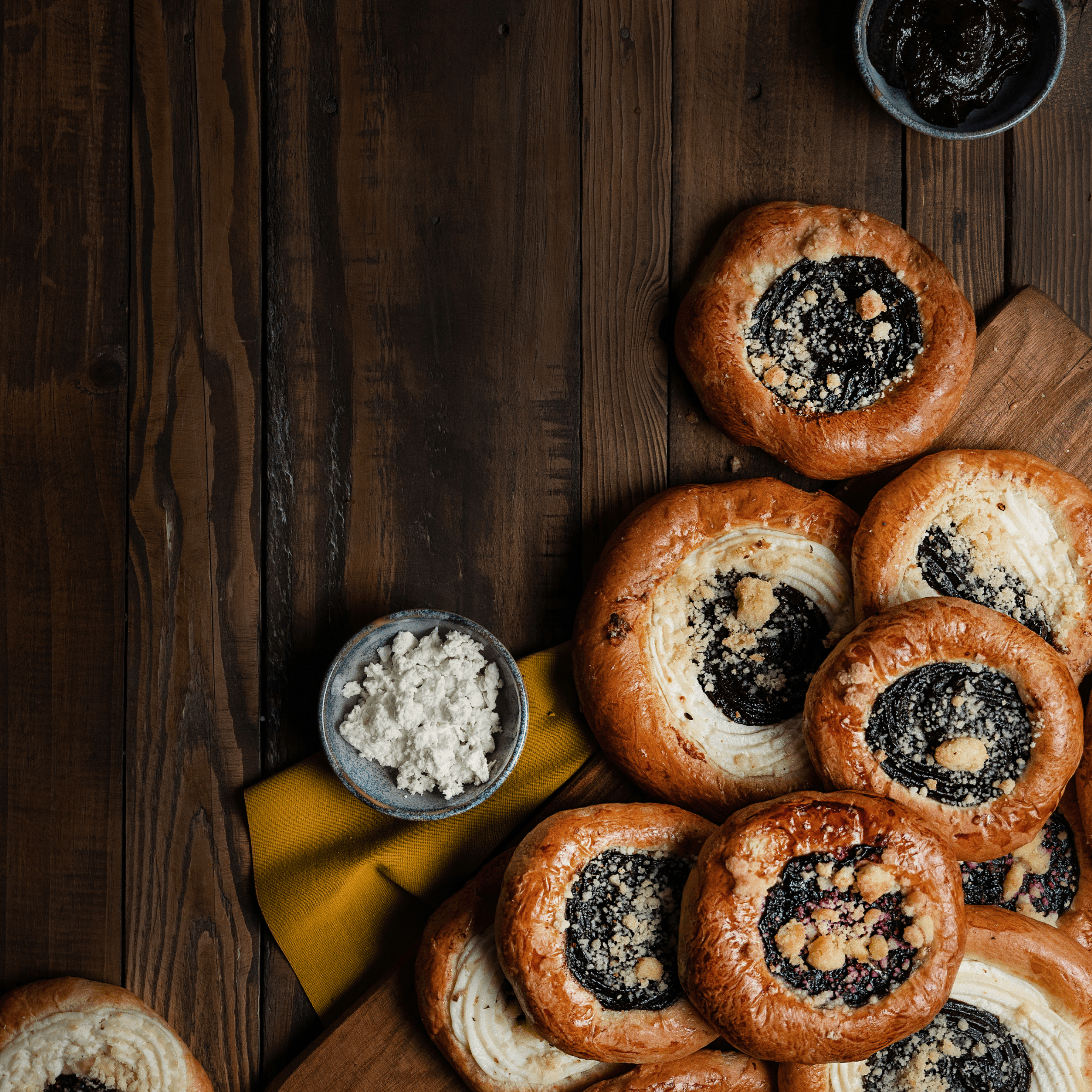
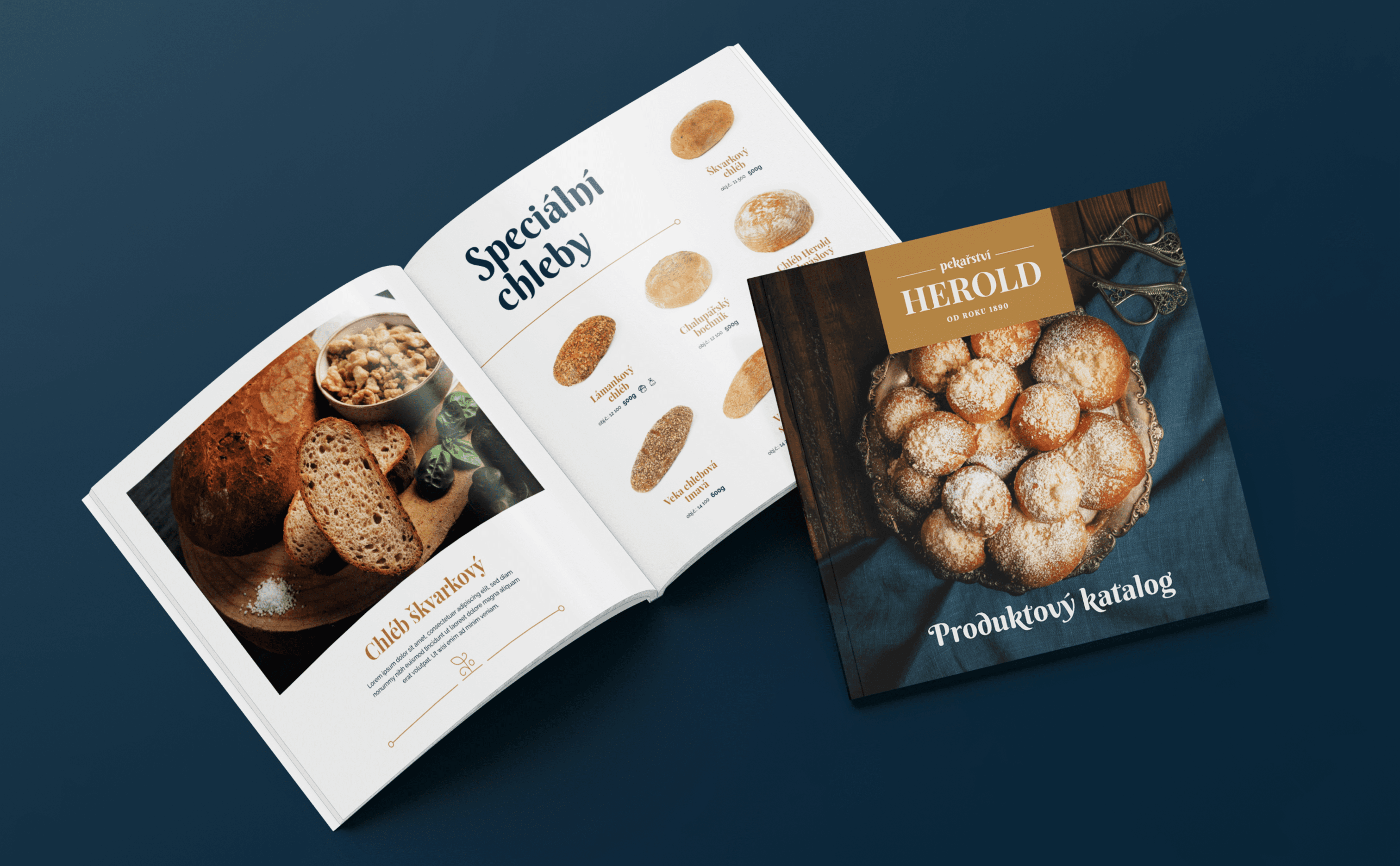
Photography was also part of the project. We needed materials for the B2B product catalog, key visuals, and posters placed in stores. We took care of everything, including food styling. During 2 days
of shooting, we managed to capture a total of 34 image shots and 102 product photos.


A Full Plate of Applications
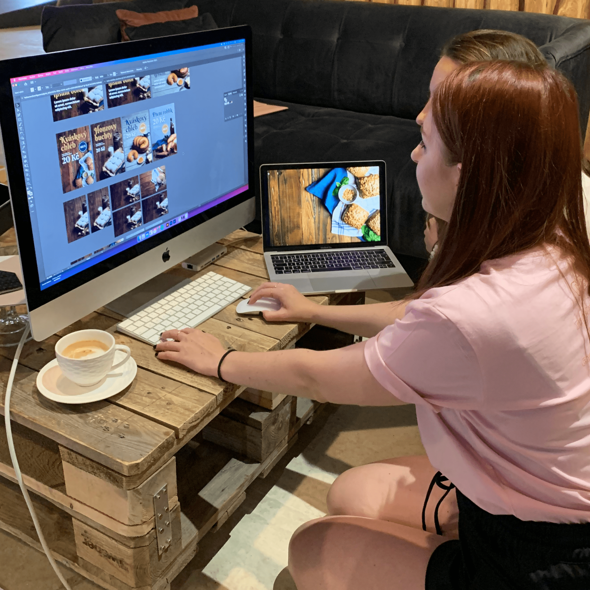
We designed more than 24 different applications, primarily meant for offline. A significant portion consists of packaging and in-store materials.
We created universal packaging, as well as specificly designed pieces for bread, pastries, cakes,
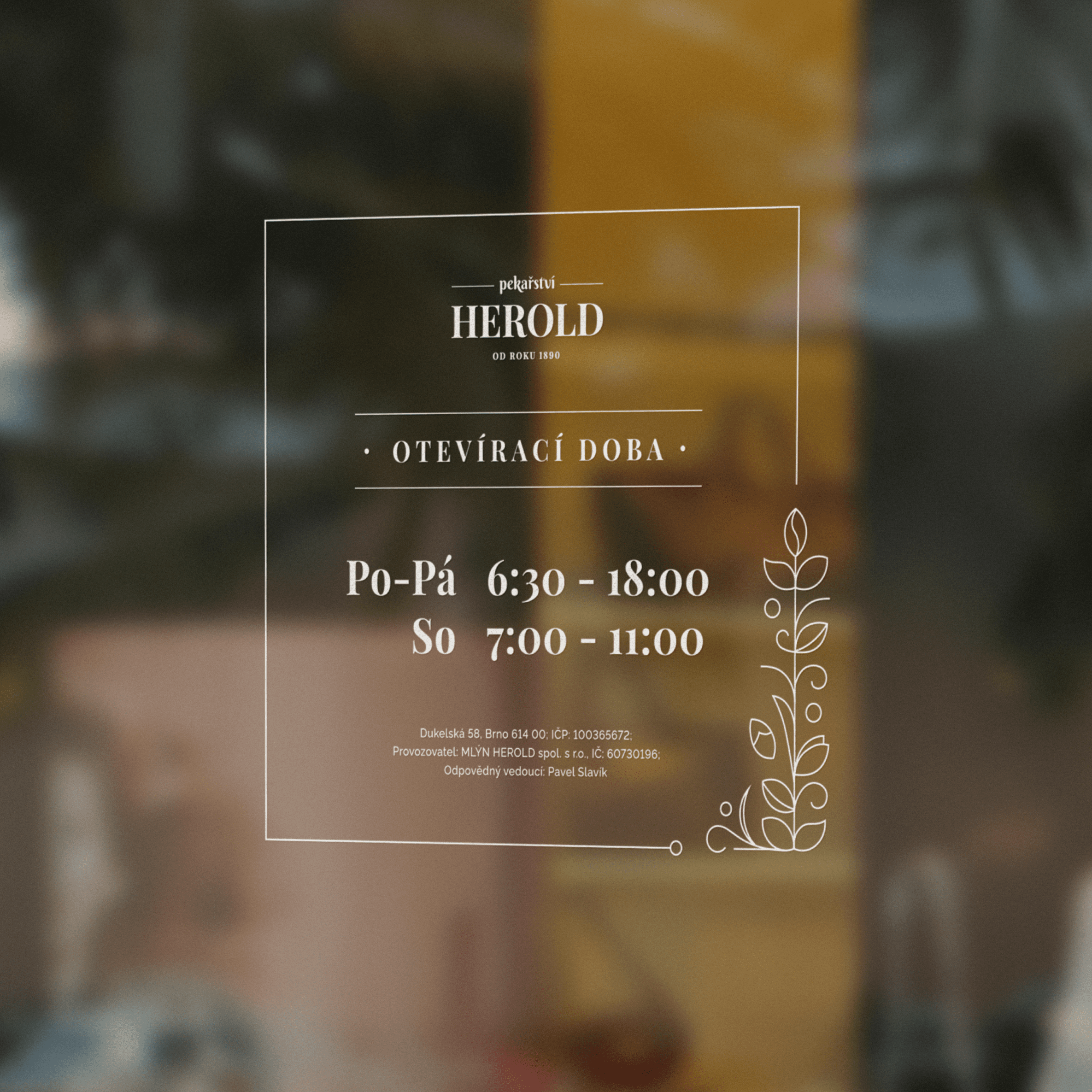
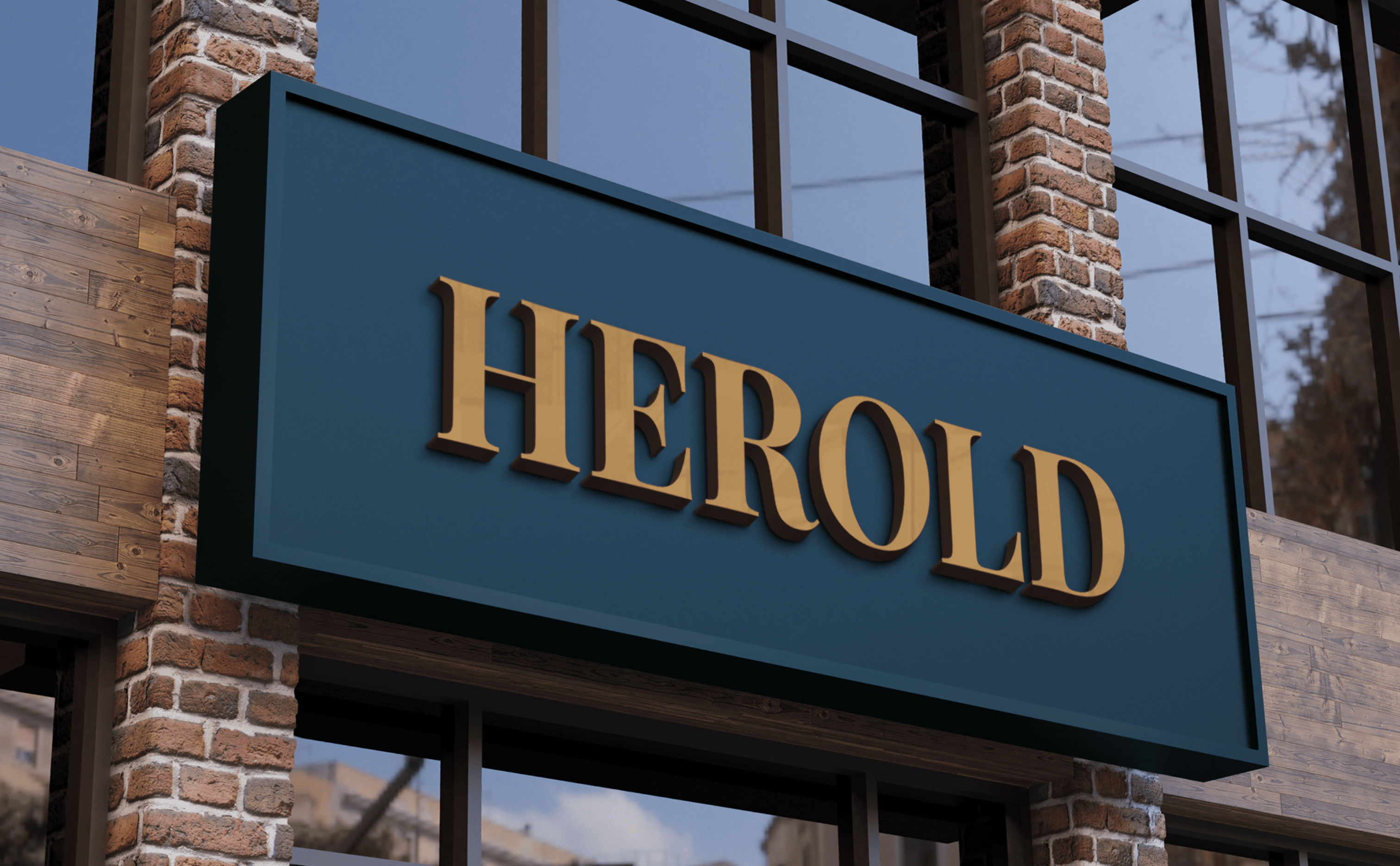
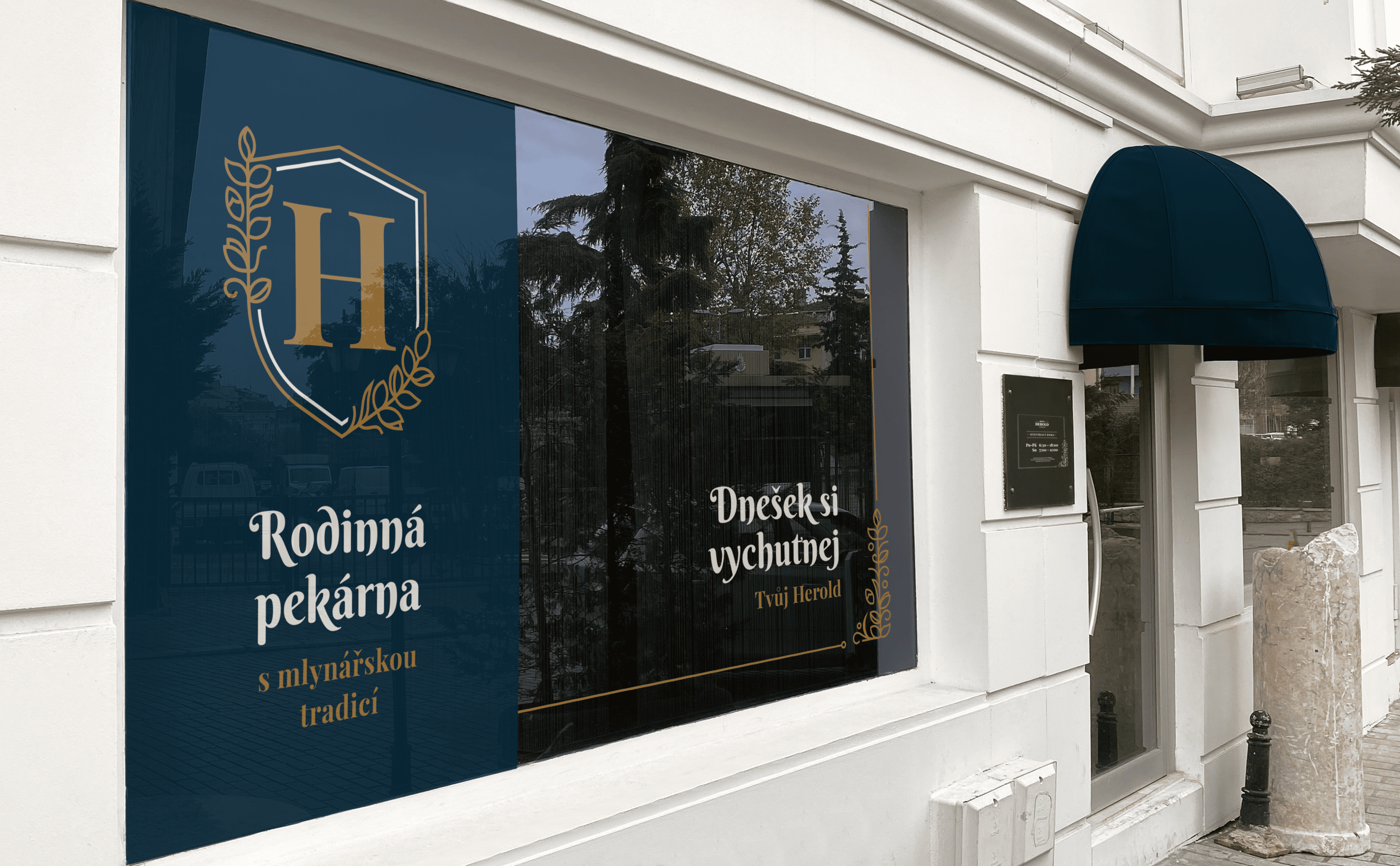
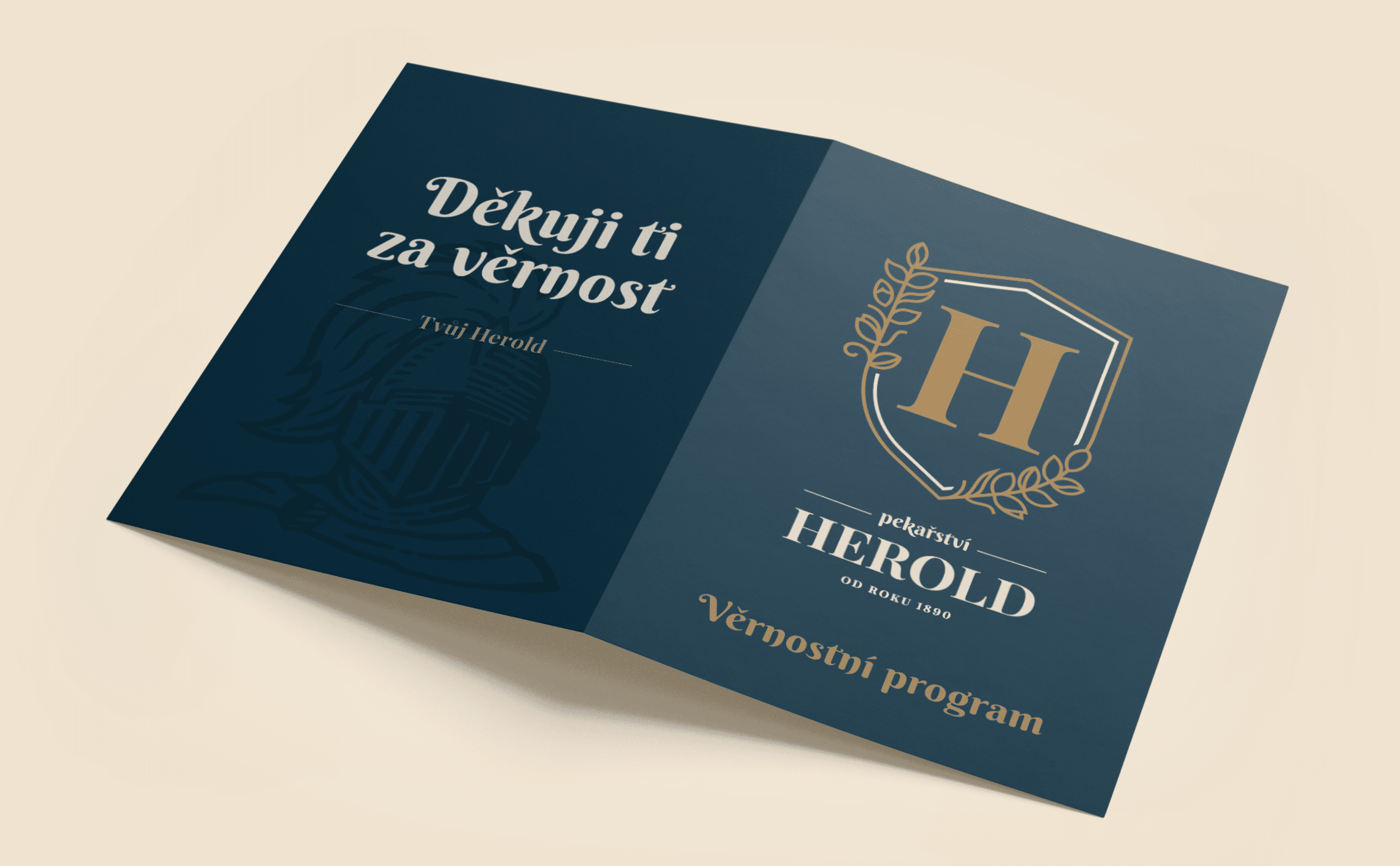
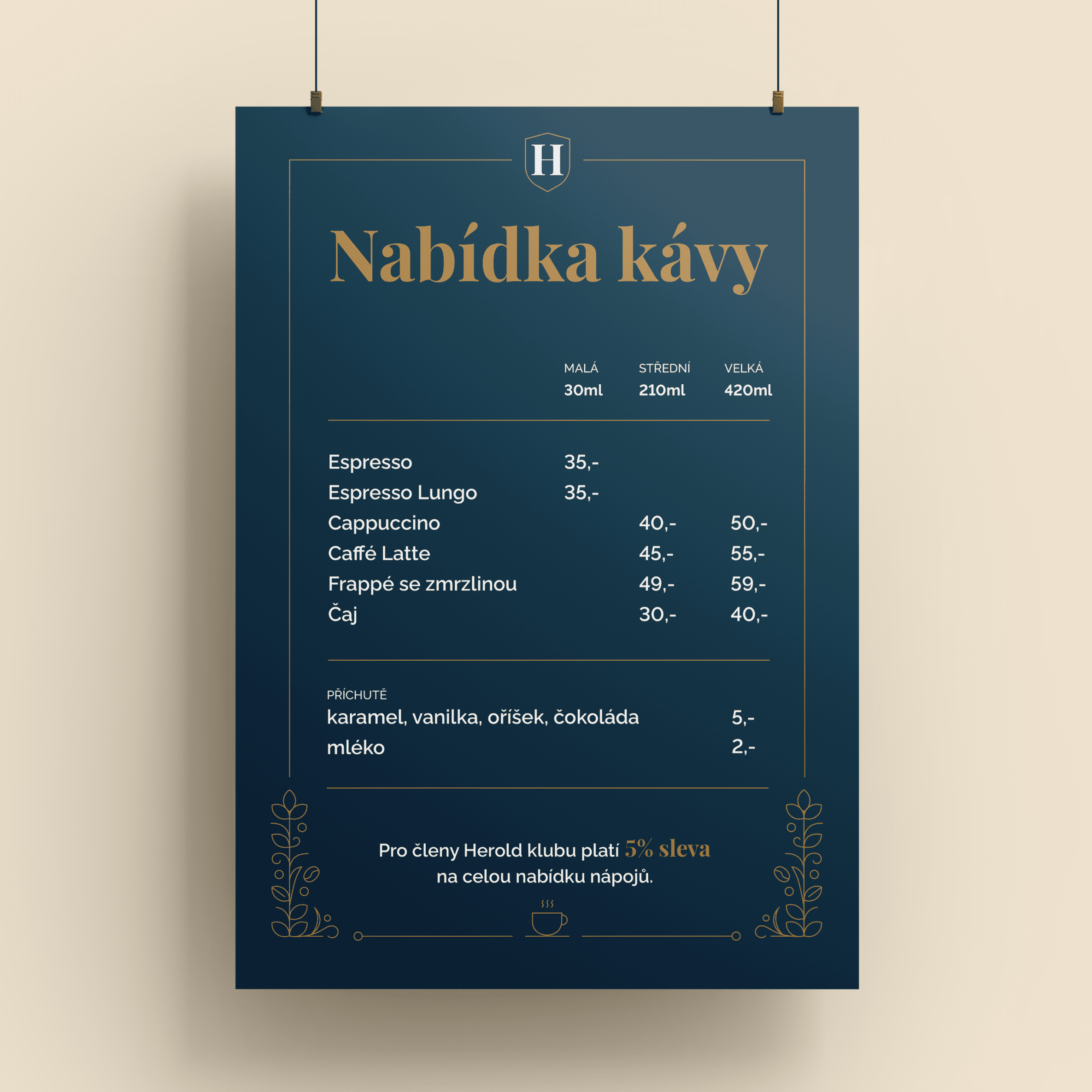
and sandwiches. We also handled signage, store windows, and printed materials such as name tags, loyalty cards, and employee attire. Take a look at the results. And let’s not forget, you can enjoy sourdough bread and cottage cheese cakes at one of the nine shops in Brno, Slavkov, and Kyjov.


It is the knight Herold himself
who talks to the customers.
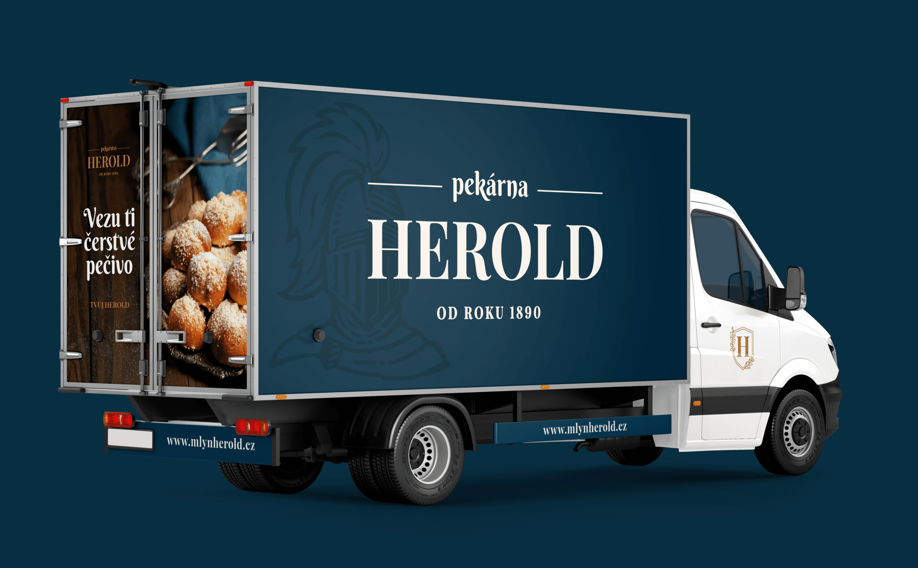
Thanks to the uniform visual style we have set in the brand book, even elements such as employee t-shirts and promotional banners harmonize with each other. Thus, the entire brand comes across as unified.
In selected applications, such as packaging materials, employee attire, or the loyalty program flyer, the knight himself has something to say.
His simple taglines contribute to the brand’s tone.



Strength lies
in simplicity.
We see too many overly complicated visuals around us – and bakeries are no exception. Herold is different. We knew that an idea of a car with a picture of a baker at work definitely won’t be the direction
we wanted to take. We bet on a simple design, acknowledging tradition and building around
the figure of the knight. Likewise, the shopping windows are clean and highlight Herold’s messages. “Enjoy today,” he bids his farewell to the customers.


