Miamo
A new ice cream brand is on its way to your freezers.
- branding
- marketing and communication strategy
- DTP
- social networks
- photography

In August 2020, Tipafrost – the largest Czech ice cream manufacturer – came to us with the desire to create and launch its ice cream brand. Two months passed, and Miamo was born. A brand with Italian sex appeal and Czech playfulness.

Did you know that it’s mainly men who buy ice creams?
Or that from the age of 35, we buy ice cream more
for others than for ourselves? And that popsicles
on a stick are more popular than cones? Neither did we at first. In order to be a bit smarter, we started with a thorough research of the ice cream segment and a subsequent branding workshop.
After that, all we had to do was let our minds relax over the weekend and step into the shower
on Monday morning. We would love to patent this process for generating brand name ideas, but it’s rumored that even Elon Musk considers it his own. Therefore, we’ll postpone that idea for now.

We smuggled a smile in the logo.
And in the colors, we projected joy, chocolate,
the sea, and sandy islands. As a sweet spot, we let the letter O the space become a scoop of ice cream, a ball on an elephant’s trunk, or a circle of loved ones and friends – that depends only on creativity and
the target group of future campaigns.


Vibrant Colors, Cheerful Illustrations, and a bit of Humor to Go with it
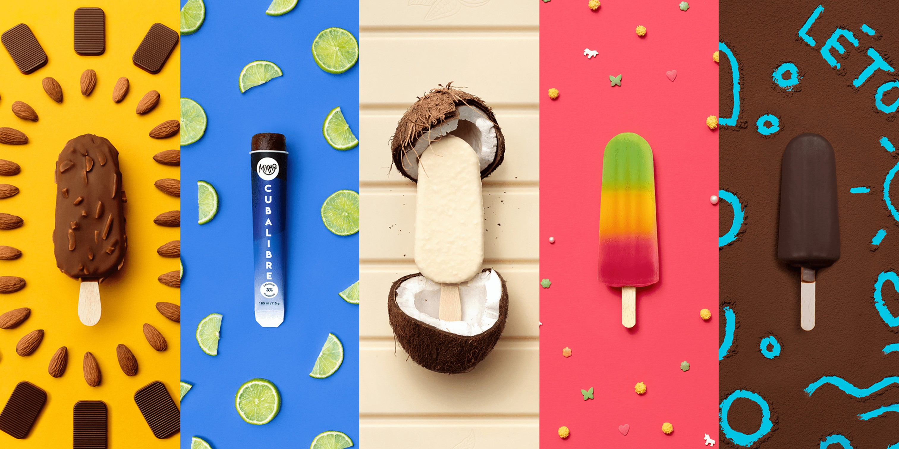
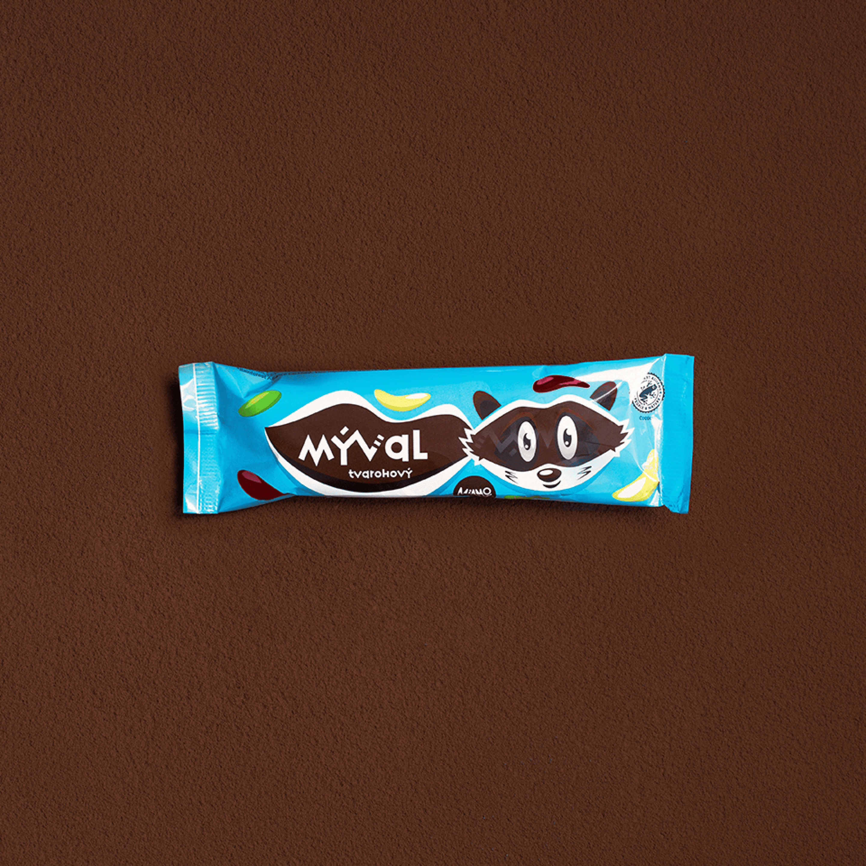
As soon as we finalized the brand strategy and communication plan for 2021, we threw ourselves into the first brand applications – new packaging for the legendary Eskimo or the brand new product line of frosi fruit popsicles. Business cards, product catalog, blackboard, boards, and stickers. We filled all this with vivid colors, cheerful illustrations, and a bit of humor. Continuing to describe the pictures is as boring as talking about the taste of ice cream, so just keep looking. Vibrant colors, cheerful illustrations, and a bit of humor to go with it.


The ice cream earned a new coat.
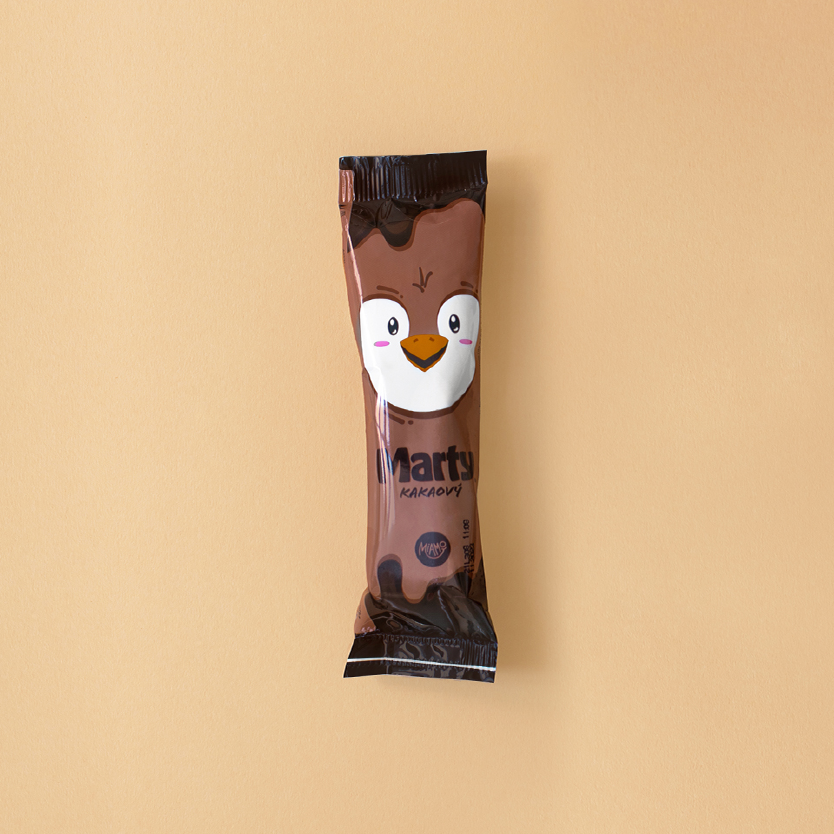
We gradually rebranded some of the ice creams, which received new packaging. Children’s popsicles got playful animals as decoration. The conservative Russian ice cream dressed in a patterned sweater.


The Taste of Joy on the Tongue.
The brand won the hearts of young and adult customers. How much work did it cost us?
Let us summarize it for you in a few refreshing numbers:


Coffee and popsicles are our daily bread. We have a freezer full of ice cream, thanks to which we can understand it deeply.
Social networks are best done when having a personal experience with the product. That’s why we enjoy working for Miamo so much – we always have a freezer full of their ice creams after regular photo shoots. Even ice cream can have a personality. We created an archetype for each of them, which
we project into the visuals. We take pictures in and around Brno, shoot funny videos, and are not afraid
to show pure joy.
On Miamo’s Facebook and Instagram, you’ll find fun posts that capture lightheartedness. We most often associate ice cream with it. The brand comes from Třebíč, which we proudly acknowledge in our communication with the hashtag #popsiclesfromtrebic.


